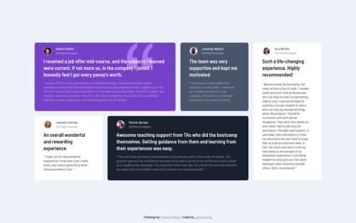
Submitted almost 4 years agoA solution to the Testimonials grid section challenge
Testimonials Grid Section using Sass, Grid, and Flex

@lancemartija
Solution retrospective
Hi again! I would like to present to you my version of this project. I'm pretty sure I got it accurately, though what I'm absolutely sure of is that my Grid game is mediocre! Hahaha. Anyway, check it out and please don't hesitate to leave your opinion about my work.
I would love to know what you think I should improve with my HTML5 semantics and the way I use Grid so that I'll be able to improve them next time.
Thank you and keep on coding!
Code
Loading...
Please log in to post a comment
Log in with GitHubCommunity feedback
No feedback yet. Be the first to give feedback on Lance Martija's solution.
Join our Discord community
Join thousands of Frontend Mentor community members taking the challenges, sharing resources, helping each other, and chatting about all things front-end!
Join our Discord