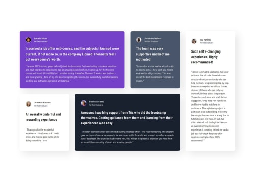
Testimonials Grid using CSS Grid with 4 breakpoints

Solution retrospective
I tried to make the design as responsive as possible and it turned out beautiful. ;)
What challenges did you encounter, and how did you overcome them?The Typography was actually the most time consuming part.
What specific areas of your project would you like help with?I don't know if the breakpoints I chose are even useful or not, I would be glad if you tell me <3
Please log in to post a comment
Log in with GitHubCommunity feedback
- P@Islandstone89
You're on a roll :)
HTML:
-
I would have the card container as a
<div>and each card as an<article>, not the other way around. -
I would wrap the quotes in a
<blockquote>element:
<blockquote>
  <p>
</blockquote>
CSS:
- For the Grid setup, I would consider using
grid-template-areasalong withgrid-area. To learn more, I highly recommend this in-depth exploration of CSS Grid areas.
Marked as helpful -
- @hybachi
This is beautiful!
I think you've nailed it with the breakpoints. There is no clear cut rule on what breakpoints you should be using since devices have such variable screen sizes. I say just focus on building your designs until it breaks and then try to fix it with a breakpoint.
You could also try to explore other methods of responsive design like fluid layouts (%, vw, clamp, min, max) to make media queries less necessary.
Marked as helpful


Join our Discord community
Join thousands of Frontend Mentor community members taking the challenges, sharing resources, helping each other, and chatting about all things front-end!
Join our Discord