Not Found
Not Found
Not Found
Not Found
Not Found
Not Found
Not Found
Not Found
Not Found
Not Found
Not Found
Not Found
Not Found
Not Found
Not Found
Not Found
Not Found
Not Found
Not Found
Not Found

Submitted

Testimonials-Grid-Section-Main

Name 40

@CrocoDealu

Desktop design screenshot for the Testimonials grid section coding challenge

This is a solution for...

  • HTML
  • CSS
2junior
View challenge

Design comparison


SolutionDesign

Solution retrospective


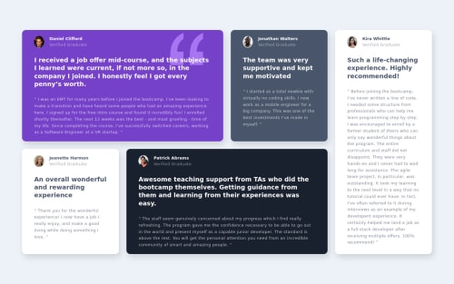
I havent created yet the mobile design but i d love some feedback for the dekstop one

Community feedback

Dušan Lukić 1,660

@dusanlukic404

Posted

Hey friend, take a look for your accessibility issues. There are a lot of them. Also, you should set smaller padding and in my opinion don't use fixed values (px) for your main container because on smaller screen's than yours it looks narrowly and there is no enough white space.

Your solution does not meets the criteria of a given design. You should make also mobile version of this solution.

Marked as helpful

1

Name 40

@CrocoDealu

Posted

@dusanlukic404 i ll use rem from now on and make the mobile version as soon as possible as well as fix my accessibility issues. Thanks for the review

0

@pikapikamart

Posted

Hey, great job on this one. Though like what you said, desktop layout is the only completed one on this one and it looks fine I suppose, just needed for it to be much smaller like on the design.

Dusan Lukic already pointed some ideas in there and yes, before submitting, it is always nice to make sure that mobile and desktop states are finished so that others could give a full review for both.

For some suggestion on the site, here are some:

  • Always have a main element to wrap the main content of the site. For this use main tag on the .container selector.
  • On a site, always have a single h1. Since there are no visible text that are suitable to be h1, the h1 would be a screen-reader only heading. Meaning it will be hidden visually but present for screen-reader users. On this, the h1 would have like sr-only class and the text-content should describe what is the main-content is all about. The h1 could be placed as the first text inside the main. Have a look at this simple snippet that I have about screen-reader h1 comments are already included on it but if you have queries about it, just let me know okay^^
  • For each of the testimonial card, I would suggest you to use this markup instead so that it will be much clearer and easier for screen-reader users to know each contents:
<figure>
  <img src="" alt={person name}>
  <blockquote>
    <p> {qoute in here}</p>
    <p> {qoute in here}</p>
  </blockquote>
  <figcaption>
    person name
    <p>
      person role
    </p>
  </figcaption>
</figure>

You need to use 2 p tag for the quote of the person. For this markup, you would need to use display: grid so that you could place each item properly.

  • Use only the person's name as the img alt and you can remove the face word on it.
  • Also, those bold texts are not really heading tag. If you read it, that text is sort of like opening text to the person's testimonial page and doesn't really inform the user on what the section would contain like a heading tag does.
  • Lastly, finishing up the mobile state and making the site as responsive as you can.

Aside from those, great job again on this one.

0

Please log in to post a comment

Log in with GitHub
Discord logo

Join our Discord community

Join thousands of Frontend Mentor community members taking the challenges, sharing resources, helping each other, and chatting about all things front-end!

Join our Discord