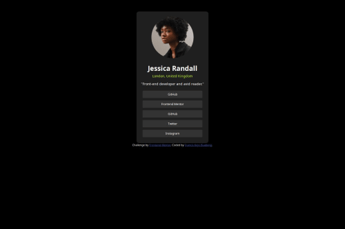
The responsiveness of this challenge was done using CSS flex

Solution retrospective
I’m most proud of how I managed to create a responsive design that closely matches the provided specifications. I took the time to ensure that the layout looks great on various devices, which was a rewarding challenge. Next time, I would focus more on optimizing my workflow to streamline my process, perhaps by breaking down tasks into smaller steps to avoid feeling overwhelmed. Overall, I learned a lot, and I’m excited to apply these insights to future projects!
What challenges did you encounter, and how did you overcome them?I encountered several challenges while working on the project, particularly with achieving the desired responsiveness across different devices. At first, I struggled with the CSS media queries, but I overcame this by researching best practices and experimenting with different approaches. I also faced some difficulties with the layout alignment, which I resolved by using Flexbox for better control. By breaking down each challenge into manageable parts and testing my solutions iteratively, I was able to create a polished final product. This experience taught me the importance of patience and persistence in problem-solving!
What specific areas of your project would you like help with?centering the div and making the size of div small as the real challenge
Please log in to post a comment
Log in with GitHubCommunity feedback
No feedback yet. Be the first to give feedback on Francis Kojo Buabeng’s solution.
Join our Discord community
Join thousands of Frontend Mentor community members taking the challenges, sharing resources, helping each other, and chatting about all things front-end!
Join our Discord