


I think the most important place for you to focus your learning is on HTML at the moment. This needs some important changes, essential for accessibility, SEO and usability.
- You only need to use the figure element if you need a figcaption. It is not a generic wrapper for all images. These images don't need a wrapping element at all, but you can use a div when the only reason is for layout purposes.
- Make sure you know how and when to write alt text on images. There is a great post about this in the resources channel on discord (search for "Alt" and you'll find it).
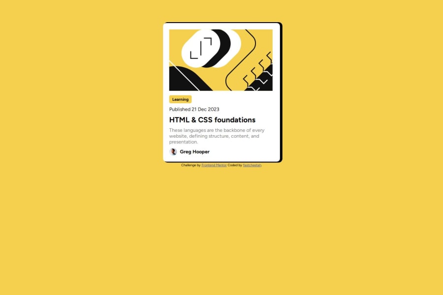
- Headings must be used appropriately. Learning is not a heading, nor is Greg's name. Heading tags must only be used when the text is an actual title for some content around it.
- Also, it's essential that headings are in the correct order. On a full Web page the headings list should act like a table of contents in a book or long document — reading it communicates the structure of the document (in this case web page) and relationships between content, and allows people to jump to the content they want. Every page has a h1 as the title of the page and then other headings below are sequential. In this case, because it's only a single component challenge, you don't need a h1, just a h2 for the blog title as you have already.
- This component would be unusable on a real site. There is no way at the moment for users to access the blog it's signposting to, because you've not included a link anywhere. There should be an anchor within the h2, wrapping the blog title text. This is what makes the card interactive to all users (eg including keyboard)
- Once you've added that link you'll need to make the whole card clickable in this case. That is not always the case, but we know the whole card is meant to be clickable in this because the design includes hover styles for the whole card. Always take note of where you see hover styles — that means something is meant to be interactive. To do this, you will need to make the card position relative and then add a pseudo element on the anchor inside the heading. That pseudo should be positioned absolutely and full height and width so it covers the whole card, effe tively making the link take up more space so the whole card becomes clickable even though the link is only small inside that card.
0
In the css I have some more tips for you 😊
- Get into the habit of including a full modern css reset at the start of the styles in every project. Andy Bell or Josh Comeau both have good ones you can look up and use.
- The card must not have a width, especially not in pixels . Give it a max width in rem instead. This makes the card immediately responsive because it can shrink when necessary (eg on smaller screens) and the layout will work for all users, even those who change their default text size.
- Don't use large margins to try and center a component on the screen. Keep margins and paddings small and use an alternative. For example, I recommend on single component demos like this, to make the body into a flex column with min-height 100svh and flex properties on it to center its children.
- Try not to use element selectors especially not generic ones like divs. This increases css specificity for no reason, makes the styles hard to read and maintain, and means you couldn't lift this component out and use it in a real site. (Because compone nt specific styling is on a
divorfigure. Place classes in what you want to style. - You can delete all media queries from this. This component does not need any.
Marked as helpful
0
Fastcheettahh• 20
@fastcheetah
Posted
@grace-snow Thank you I never knew of the advantages of rem and it could be responsive in a site.
0
