Submitted over 3 years agoA solution to the 3-column preview card component challenge
Three column preview card component using Flexbox

@casserole27
Solution retrospective
I found the buttons a little bit difficult while building the project, specifically their width. I used a percentage measurement that seemed to go well as far as responsiveness, but is there a best practice?
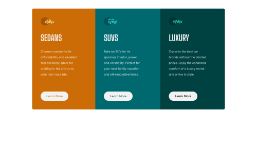
I found this to be a fairly straightforward exercise in Flexbox, which I seem to be getting the hang of. I also changed the original orange color to a darker hue because an accessibility check yielded a low contrast warning.
Code
Loading...
Please log in to post a comment
Log in with GitHubCommunity feedback
No feedback yet. Be the first to give feedback on C Lewis's solution.
Join our Discord community
Join thousands of Frontend Mentor community members taking the challenges, sharing resources, helping each other, and chatting about all things front-end!
Join our Discord