@karenefereyan
Posted
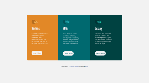
This is super neat, Artir. I love the way you structured your code so simply. Lovely one. You might want to take a look at the HTML issues and update as needed. Also I think you should increase the paddings on the left and right for the buttons as the learn more stacks on top instead of side by side on desktop screen..
Lastly, its always difficult finding out when to use anchor tags or buttons. Typically though, a link should be used when we want users to navigate to a different section of the site whether on the current page or not. In the case of a button though, it's used majorly when its functionality is dependent on JavaScript code or if the button is within a form, in which case the type attribute determines the default event. A good example of where a button should be used would be if a user wants to crafts an account, in which case, he would have filled a form.
In this case, what should happen ideally is that when the user clicks the learn more link, it takes him/her to a different section. You might refer to this article, https://css-tricks.com/a-complete-guide-to-links-and-buttons/.
But overall very pretty. keep coding
Marked as helpful