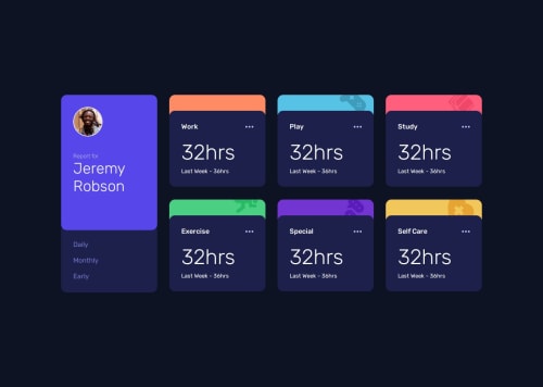
Skip to content
  • Unlock Pro
  • Log in with GitHub
Solution
Submitted 4 months ago

Time tracking app

P
Mihailo Sparic•300
@MihailoSparic01
A solution to the Time tracking dashboard challenge
View live sitePreview (opens in new tab)View codeCode (opens in new tab)

Solution retrospective


What are you most proud of, and what would you do differently next time?

Of successfully completing the HTML and CSS part.

What challenges did you encounter, and how did you overcome them?

I'm currently challenging myself by working with JSON. For now, I'll have to put the JSON part on hold until I figure it out.

What specific areas of your project would you like help with?

Could you tell me why my section overflows when I shrink the browser window?

Code
Select a file

Please log in to post a comment

Log in with GitHub

Community feedback

  • P
    Carl•1,235
    @CarlHumm
    Posted 4 months ago

    Hi there

    Updated answer.

    The total width of your container does not consider the three grid gutters caused by grid-gap, which adds to the grid size overflowing the section and body. Your minimum grid size 800px, but your next breakpoint for adapting layout is 768px.

    repeat(4, minmax(20rem, 1fr))
    

    At minimum, the grid can be 4 x 200 = 800px. At maximum it can be [viewport] / 4 until it reaches 1116px (Your containers max-width).

    So if we are at 800px viewport. Your grid will be divided into four. 800 / 4 = 200. Does this take into account grid-gap and gutters? No, you should factor this into the calculations for deciding on minimum column sizes.

    So you have three grid gutters each 32px wide. That's 3x32 = 96.

    800 + 96 = 896.

    Overflows between 768 and 896

    How do we know this is accurate? By hovering over the element in dev tools whilst between 768 and 896px viewports. The container will show a width of 896px regardless (overflowing section) but will show 897 if you enlarge viewport.

    Because we don't use auto-fill or auto-fit, there is no wrapping so that minimum number for your column widths sets a fixed size for your grid. This should align with your media queries (768px).

    You can add some padding-inline to the section to provide space between the grid and viewport without contributing towards size.

    Good luck on future projects :)

Join our Discord community

Join thousands of Frontend Mentor community members taking the challenges, sharing resources, helping each other, and chatting about all things front-end!

Join our Discord
Frontend Mentor logo

Stay up to datewith new challenges, featured solutions, selected articles, and our latest news

Frontend Mentor

  • Unlock Pro
  • Contact us
  • FAQs
  • Become a partner

Explore

  • Learning paths
  • Challenges
  • Solutions
  • Articles

Community

  • Discord
  • Guidelines

For companies

  • Hire developers
  • Train developers
© Frontend Mentor 2019 - 2025
  • Terms
  • Cookie Policy
  • Privacy Policy
  • License

Oops! 😬

You need to be logged in before you can do that.

Log in with GitHub

Oops! 😬

You need to be logged in before you can do that.

Log in with GitHub

How does the accessibility report work?

When a solution is submitted, we use axe-core to run an automated audit of your code.

This picks out common accessibility issues like not using semantic HTML and not having proper heading hierarchies, among others.

This automated audit is fairly surface level, so we encourage to you review the project and code in more detail with accessibility best practices in mind.

How does the CSS report work?

When a solution is submitted, we use stylelint to run an automated check on the CSS code.

We've added some of our own linting rules based on recommended best practices. These rules are prefixed with frontend-mentor/ which you'll see at the top of each issue in the report.

The report will audit all CSS, SCSS and Less files in your repository.

How does the HTML validation report work?

When a solution is submitted, we use html-validate to run an automated check on the HTML code.

The report picks out common HTML issues such as not using headings within section elements and incorrect nesting of elements, among others.

Note that the report can pick up “invalid” attributes, which some frameworks automatically add to the HTML. These attributes are crucial for how the frameworks function, although they’re technically not valid HTML. As such, some projects can show up with many HTML validation errors, which are benign and are a necessary part of the framework.

How does the JavaScript validation report work?

When a solution is submitted, we use eslint to run an automated check on the JavaScript code.

The report picks out common JavaScript issues such as not using semicolons and using var instead of let or const, among others.

The report will audit all JS and JSX files in your repository. We currently do not support Typescript or other frontend frameworks.

Oops! 😬

You need to be logged in before you can do that.

Log in with GitHub