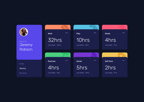
Time Tracking Dashboard built in React

Solution retrospective
Another project I built using styled components and theme provider. It's not perfect, some text appears a little off when comparing it directly to the preview images but I'm sufficiently happy with how it turned out.
When it comes to the code, I'm not too sure if the way I did the switching between day/week/month data and all the prop passing between the components correctly. It works but it just... feels wrong. Maybe someone who's more experienced can take a look and let me know how I could improve.
As always, any and all tips and critiques are welcome :)
Please log in to post a comment
Log in with GitHubCommunity feedback
- @pikapikamart
Hey, great work on this one. Layout in desktop is really great and it is responsive as well. The mobile layout looks really great as well.
Some suggestions would be:
- I think it will be better if the left side and right side are in their own parent container and not using 1 whole grid. Since those 6 box/cards are a section of their own as well for the person and the selection.
- Person's
imgshould be using the person's name as thealtlikealt="Jeremy Robson". A component like this when a person's name and image are both present, use the person's name as the value as it is a meaningful image. - When wrapping a text-content do not just use
spanto wrap it, use meaningful element like aptag if it just a regular text or heading tag if it is an heading. - For the selections, since you made use of
buttonit would be great to nest them inside aulsince those are "list" of selections and user will have an extra information on how many selections are there in the list. Also it would be great to nest that component inside asectionwith a screen-reader only heading tag that describes what is that section is all about. Lastly, anaria-liveelement that announces the changes or announces the selection has been selected, sincebuttononly does not give extra information. - Another approach for the selections is to make those selections
input type="radio"it then will be inside afieldsetalong with a screen-reader onlylegendelement that exactly do the same with the screen-reader heading I mentioned above. This way, users will get extra information on what is selected even without usingaria-liveelement. - Those decorative images on the site could have use an extra
aria-hidden="true"attribute so that they will be totally hidden alongside with thealt="" - Since you made the 3 dots interactive using
buttonyou should add eitheraria-labelattribute or screen-reader element inside. The value will describe what does thebuttondo. imginside the 3 dotsbuttonshould be hidden as well using the method I mentioned above.
Aside from those, the site looks really great and this is a great solution to be honest.
Marked as helpful

Join our Discord community
Join thousands of Frontend Mentor community members taking the challenges, sharing resources, helping each other, and chatting about all things front-end!
Join our Discord