Time Tracking Dashboard Design

Solution retrospective
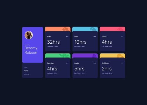
Hi guys, please review what can I improve in my code. I had to go implement a lot of flex inside grid. Not sure if this was expected, but I tried to code the design, but I need to be more familiar with pixel perfect detailing like most of you. Please point out mistakes so that I can improve and also share best-practices to follow for such massive design. It was tough to give time along with my job, but it was fun to implement a brainstorming solution with crunch of time. It might not be the best solution, but I'm glad that it is working.
Please log in to post a comment
Log in with GitHubCommunity feedback
No feedback yet. Be the first to give feedback on Shailendra Kumar's solution.
Join our Discord community
Join thousands of Frontend Mentor community members taking the challenges, sharing resources, helping each other, and chatting about all things front-end!
Join our Discord