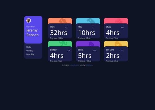
Time tracking dashboard using Fetch in JS

Solution retrospective
That I finished the challenge and did not give up. Next time I will try to work on the project faster.
What challenges did you encounter, and how did you overcome them?Fetching the data from the JSON file. I overcame this by watching a few tutorials on Youtube.
What specific areas of your project would you like help with?1.How can I fetch and Update the data to my Html file. 2.How to create a design for smaller screens. 3.Is there a simpler way to do this challenge?
Please log in to post a comment
Log in with GitHubCommunity feedback
- @AdrianoEscarabote
Hello Faith Achieng, how are you? I was really pleased with your project, but I’d like to offer some advice that might help:
Avoid using the
<br>tag in your HTML code. While<br>might seem like a simple way to break lines, it is considered bad practice and can lead to significant accessibility concerns. For users who rely on screen readers, the presence of<br>can be announced, which disrupts the flow of the content and creates a confusing experience.Instead of
<br>, you should use semantic HTML to structure your content properly. For example, wrapping text in paragraphs (<p>) or using<div>containers for sections provides a cleaner and more accessible solution. This approach improves usability for screen readers and ensures that your content is presented in a meaningful way to all users.For more detailed guidance, refer to the MDN documentation on the
<br>tag: MDN: Accessibility Concerns of <br>Pro Tip: Accessible web development isn't just a recommendation—it's essential for ensuring inclusivity on the web!
The rest is spot on.
Hope it’s helpful to you. 👍
Marked as helpful - @lordag
It seems to me that you are on the right track, here are some tips. It is important to use semantic html so that it can be used by as many people as possible. I recommend you start from the mobile layout (Mobile-first workflow) and then move on to the desktop version. In this case you could have used flexbox for mobile and grid for the desktop version. Use relative units such as rem or em instead of absolute units such as px it is a common practice to improve accessibility, scalability and management of responsive design.


Join our Discord community
Join thousands of Frontend Mentor community members taking the challenges, sharing resources, helping each other, and chatting about all things front-end!
Join our Discord