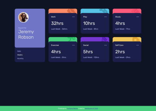
Time Tracking Dashboard – Vanilla JS, SCSS, Responsive

Solution retrospective
What I'm most proud of:
I'm particularly proud of how clean and responsive the UI turned out. I managed to replicate the design very closely across all screen sizes using just SCSS and vanilla JavaScript. Additionally, dynamically loading and updating the time tracking data from JSON without relying on any frameworks really helped reinforce my understanding of DOM manipulation and state management in plain JavaScript.
What I'd do differently next time:
Next time, I would:
- Use a JavaScript framework like React or Vue to manage state and UI updates more efficiently.
- Incorporate unit testing (e.g., with Jest) to ensure the logic for switching timeframes works perfectly under all conditions.
- Implement localStorage to remember the last selected timeframe on page reload.
- Add animations or transitions when switching between views for a smoother UX.
Challenges I encountered and how I overcame them:
One of the main challenges I faced was ensuring layout consistency across different screen sizes, especially when transitioning between mobile, tablet, and desktop views. At first, the activities-container didn't align perfectly with the dashboard-container, which created an unbalanced appearance. I resolved this by thoroughly reviewing my CSS structure, adjusting height calculations, and using flex and grid properties more effectively to maintain proportional spacing.
Another challenge was managing the data dynamically using only JavaScript and JSON. It required careful DOM manipulation to ensure the time tracking cards updated correctly when switching between daily, weekly, and monthly views. I overcame this by writing clean, modular functions, add the images to the Json file and thoroughly testing the logic with different datasets.
Lastly, styling the hover and active states consistently across components took some refining. I used SCSS nesting and variables to manage reusable styles more efficiently.
These challenges helped me grow more confident in structuring CSS for scalability and writing cleaner, more maintainable JavaScript.
What specific areas of your project would you like help with?Areas I’d appreciate feedback on:
Responsive Layout Tweaks: While the project is responsive, I’d like expert insights on better handling height alignment issues between dashboard-container and activities-container, especially on medium-sized screens.
Code Optimization: I’m interested in any suggestions to improve the JavaScript logic used for switching between timeframes (daily, weekly, monthly) — particularly on making the code more modular or efficient.
SCSS Structure: Feedback on how I’ve structured and nested SCSS would be appreciated. I'm curious if there's a cleaner way to organize variables, mixins, or responsive styles.
Please log in to post a comment
Log in with GitHubCommunity feedback
- P@Kellenkjames
Great job implementing the functionality and getting the dashboard working! I especially like your clear structure and how you've handled button feedback logic — nice touch.
A few suggestions to take it to the next level:
-
🔁 Use event delegation instead of adding multiple listeners manually — it’s more scalable and keeps your code DRY.
-
📚 Replace the nested ternary operator with a simple mapping object for better readability and maintainability.
-
🌐 Avoid using global state like
let activityData = []— try to encapsulate logic within a function or module to reduce side effects. -
📱 I also noticed a layout issue with the footer on tablet viewports. It appears to shift unexpectedly. Consider using
position: fixedinstead ofposition: absolutefor more consistent behavior.
You're definitely on the right track — refining patterns like these will level you up fast.
Marked as helpful -

Join our Discord community
Join thousands of Frontend Mentor community members taking the challenges, sharing resources, helping each other, and chatting about all things front-end!
Join our Discord