


Raymart Pamplona• 16,140
@pikapikamart
Posted
Hey, awesome work on this one. Layout looks really great in desktop, responds very well and the mobile is really great as well.
Some suggestions would be:
- The
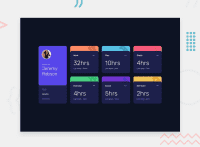
altfor the person'simgshould have used the person's name as the value likealt="Jeremy Robson", if there are components like this when a person's name is present along with their image, use their name as the value. Also, avoid using words that relates to "graphic" like "profile, picture, image...", you don't need to add those since it is already an image. - I wouldn't really make the person's name a
h1rather make ith2, theh1would be a screen-reader only text placed first as a direct child element of the main like this:
<main>
  <h1> Time tracking dashboard example </h1>
  { ...rest is in here }
</main>
- Those 3 dots, in a really application, those would be control for some modal of some sort, so using
atag on them is not really suited, instead usebuttonbut, since the challenge doesn't involve any other interactions, it could just be adivor maybe just go forbutton. - The
altas well for the dotsimgshould be usingalt=""since it is just a decorative image, also addaria-hidden="true"on it as well. - The
5hrs1hrsthose are not suited to be heading tags, the name before them like theworkplay, those are the heading tags, because it gives an overview to what the content is all about, unlike those numbers, they don't really give much information right. - On the selection at the bottom left, it would be great if they were
input type="radio"since those are selections and radio buttons are intended for those. Making it radio buttons gives more accessibility feature for users. Those radio buttons should be wrapped inside afieldsetalong withlegendthat describes what the radio buttons are for.
Aside from those, really great job on this. This is really responsive:>
Marked as helpful
1
hao pham• 745
@jerry-the-kid
Posted
@pikamart Thanks for your time making this comment. I learn alot from it <3
0

