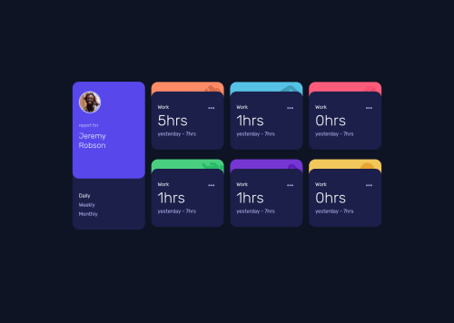
Not Found
Not Found
Not Found
Not Found
Not Found
Not Found
Not Found
Not Found
Not Found
Not Found
Not Found
Not Found
Not Found
Not Found
Not Found
Not Found
Not Found
Not Found
Not Found
Not Found

Submitted

timeTracking

@Al-Baraa-Bakri

Desktop design screenshot for the Time tracking dashboard coding challenge

This is a solution for...

  • HTML
  • CSS
  • JS
2junior
View challenge

Design comparison


SolutionDesign

Solution retrospective


This Is My First Junior Challenge With Animation .. I am Waiting Your Feedback :)

Community feedback

@pikapikamart

Posted

Hey, great work as well on this one. Desktop layout looks great, it is responsive and for the mobile state, the white-spaces are too large and I don't think you need to add those on this challenge as well.

Some suggestions would be:

  • Avoid using height: 100vh on a large container like the body tag as this limits the element's height based on the remaining screen's height. Instead use min-height: 100vh, this takes full height but lets the element expand if needed.
  • On the grid, it would be much better if the person's container as well the selection container are inside a single parent container and those 6 cards on the right side are inside their own parent element as well. Doing this, you are making your markup more clearer because your related components are being grouped properly.
  • Person's img should be using the person's name as the alt like alt="Jeremy Robson". A component like this when a person's name and image are both present, use the person's name as the value as it is a meaningful image.
  • Also when using alt attribute, avoid using words that relates to "graphic" such as "logo" and others. An img is already an image/graphic so no need to describe it as one.
  • Person's name should be a heading tag, since you haven't made use of h1 which should always be present on a page, you could make the person's name "for now" an h1, but look up screen-reader h1 okay.
  • Using p tag for the selection is not accessible. Don't use un-interactive element for interactive components. On this, you could make it like a "list" of button selections, so you could use ul with 3 button inside (li being used) but you would need to create an aria-live element that will announce if the a certain button is selected, you need to add this since button only is not much informative.
  • Another approach is to make use of set of radio buttons for those, since it is a selection, radio buttons are good for those. This 3 radio button should be inside a fieldset element with a screen-reader only legend element, the legend will describe what the sets of radio buttons are for.
  • Each card image are just decorative. Decorative image must be hidden at all times by using alt="" and extra aria-hidden="true" attribute on the img tag.
  • Each card title like work could use a heading tag, since it describes what the section will contain.
  • Also, there is an svg I think for the 3 dots, better using it.

Aside from those, great work again on this one.

2

Please log in to post a comment

Log in with GitHub
Discord logo

Join our Discord community

Join thousands of Frontend Mentor community members taking the challenges, sharing resources, helping each other, and chatting about all things front-end!

Join our Discord