Tip-calculator

Solution retrospective
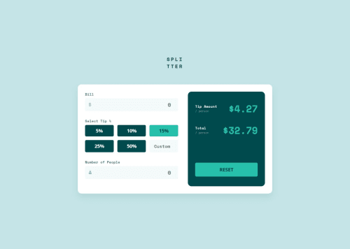
I'm proud of successfully replicating the mobile design layout using clean HTML and CSS, especially getting the tip percentage buttons and result display to match the design. I also learned more about CSS Grid and form styling.
Next time, I would plan the component structure earlier and break down input validation and logic into smaller, manageable parts. I’d also pay more attention to accessibility from the start (e.g., better use of aria-labels, form semantics)
What challenges did you encounter, and how did you overcome them?One challenge was aligning the input fields with the icons exactly as shown in the design. The input padding and icon alignment took some tweaking. Another was calculating and updating the tip and total per person dynamically—I had to rework my JavaScript logic to handle edge cases (e.g., empty inputs or zero people).
I overcame these by:
Using flexbox to align the icon and input elements.
Breaking down the calculation logic step-by-step and testing values manually.
Referring to documentation and examples for better event handling and DOM manipulation.
What specific areas of your project would you like help with?I'm not confident in how I handled custom tip percentages. How can I improve the UX for the “Custom” input field?
Is there a more robust way to structure the calculation logic using modular or reusable JavaScript?
I want to make sure my solution is accessible and responsive — any tips for improvement?
Any feedback on UI accuracy, input validation, or clean code practices would be appreciated!
Please log in to post a comment
Log in with GitHubCommunity feedback
No feedback yet. Be the first to give feedback on Piyush Rajput's solution.
Join our Discord community
Join thousands of Frontend Mentor community members taking the challenges, sharing resources, helping each other, and chatting about all things front-end!
Join our Discord