
Code
Couldn’t fetch repository
Please log in to post a comment
Log in with GitHubCommunity feedback
- @SortJakke
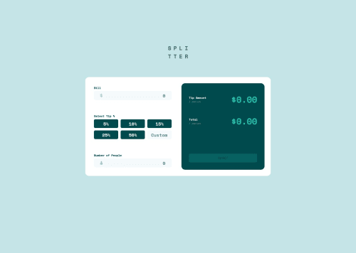
Design and functionality:
- The calculator is currently accepting negative values, which could compromise its functionality in scenarios where only positive numbers are needed.
- The error message is misaligned, and the input does not change its border when displaying an error, which affects visual perception and usability.
Suggestions for the code:
- I recommend using position: absolute on the error span and aligning it according to the specified design to ensure visual consistency.
- Input images can be added via background-image in the CSS, simplifying the HTML and making design adjustments easier.
- Using a label associated with the input is more semantically correct and provides accessibility benefits, such as improved interaction for users relying on assistive technologies.
- To prevent negative values in numeric inputs, you can add the min="0" attribute directly in the HTML. However, the more robust approach would be to implement validation in JavaScript, providing greater control over the data entered.
- Using a <form> to wrap the calculator elements would make the code more organized and semantic while also facilitating JavaScript integration for event handling and validations.
Final considerations: Despite these adjustments, the solution presented is visually aligned with the proposed design and offers a functional experience that would work well for an average user. Congratulations on the work!
Marked as helpful

Join our Discord community
Join thousands of Frontend Mentor community members taking the challenges, sharing resources, helping each other, and chatting about all things front-end!
Join our Discord