


@mariusfa
Posted
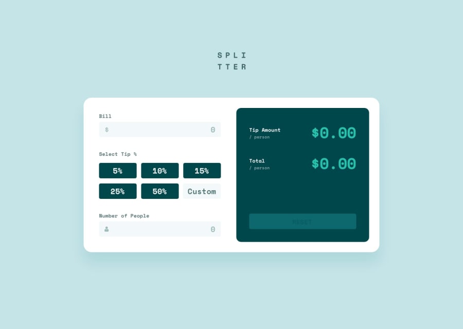
Nice job. The site is close to the design and works.
For responsive the design one can play around with @media queries in css. My understanding is try to make it responsive without this and use the @media for exceptions. An example here would be to use @media to change flex direction such that the green container goes below the input fields for small screens.
@media (max-width: 750px) {
        flex-direction: column;
}
A minor thing is that highlighting/selecting the input fields changes the sizes/position av bit. This is fixed by setting the normal border as the same as the border when it is selected, and then only change the border color when it is selected.
Found a small bug. When typing 0 in number of people the error message does not pop up. However when I remove the 0, the message pops up
@bharath-sampath
Posted
@mariusfa THanks a lot for your feedback!! I am trying my best to get the responsiveness wrkoing with only flexbox without media queries. All of my units are either em/rem or percentages. I am struggling with defining the height and width relative to body/html and parent tags. Since all are different units I am getting lost. Is there a well defined way/best practice to streamline units of measure across the elements so that they inherently become responsive? without providing the pixel values i mean. And avoiding media queries off course. Thanks again for your feedback i will dabble with media queries also! and will look at the bug as well :) I am currently enabling the error only when the input box is touched and not dirty.
@mariusfa
Posted
@bharath-sampath I prefer using REM most of the time. PX for some width or just use percentage. EM I haven't understood myself when to use
For more responsiveness you could play around with properties such as max-width. Ex max-width: 900px. This will make your container be 900px width on desktop, and on phones it will go full screen width. Min/max props seems very powerful for responsiveness.
@bharath-sampath
Posted
@mariusfa Thank you. Will try that out! Thanks a ton for your feedback and inputs!!
