


Hello
This looks good and works well functionally
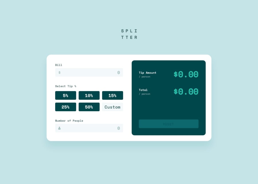
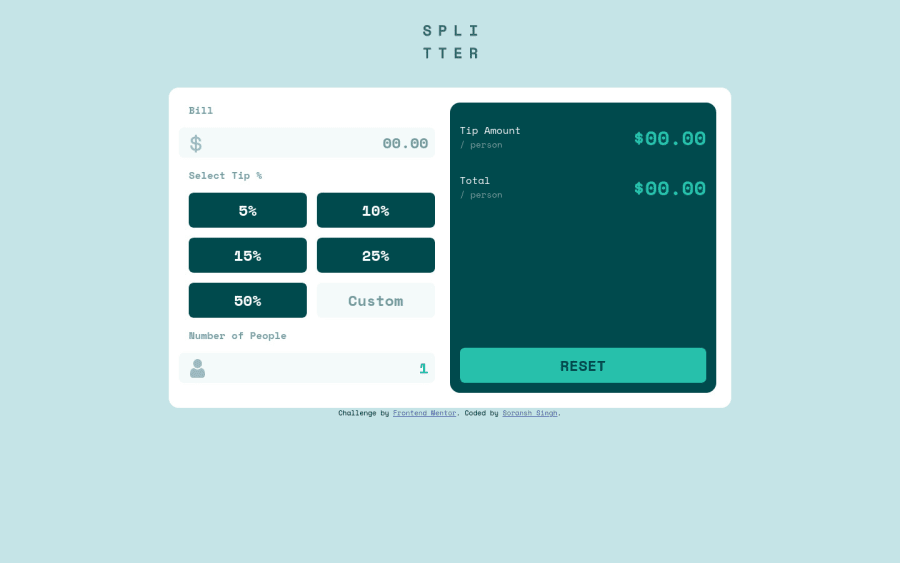
I'd probably use radio buttons for this as well tbh... what you've done still sort of works but isn't very clear.
There are definite accessibility issues with this though. It's not clear from the document structure what's happening. I think this needs
- to be a form
- to have labels for inputs (e.g. Bill is really a label)
- to have error messages linked to their inputs with aria-describedby and aria-live (make errors display none until they have content, or add aria-live attribute dynamically at the same time as adding that error message content)
- Use more obvious and consistent focus visible styles (e.g. reset has no focus style)
- style the buttons to show which tip is actually applied
- use sections and headings or legends if needed in the form
I think you need some body padding or margin on main to stop content hitting the sides at some screen sizes.
It also looks like you're using margin and padding very inconsistently in this, adding it on individual elements in different directions. You could make all that a lot simpler with some forward planning...
Good luck
Marked as helpful
p.s. Remember to remove console.logs ;)
@soransh-singh
Posted
@grace-snow thanks .... Your comment is Really helpful

