


@Hazipan
Posted
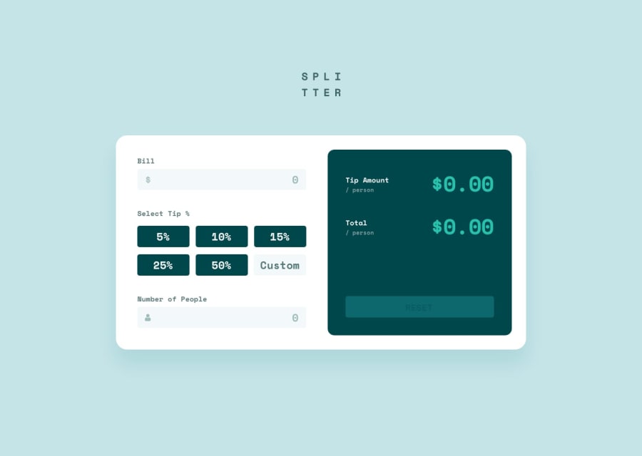
I don't think your state is overkill at all! That seems like a great way to handle each interactive component. Some suggestions, right now the input for the bill and number of people have numbers inside them when the page loads. It's uncomfortable to have to erase what's already there to put in my own numbers. What you can do is set an initial value for the buttons when the page first loads and then change the value when something is typed in. Remove the number's that are inside the input fields and put them in a placeholder attribute. That way the numbers are still there, but when I click on the field, I don't have to erase what's already in there. Other than that, it works great!
Sizing-wise, it's a bit uncomfortable because it doesn't fit on the screen very well. The logo touches the top and the calculate touches the bottom of the screen. I would suggest putting some margins or padding on the top and bottom to make it a little more comfortable, and maybe reduce the overall spacing. There's quite a bit of space between each section of the calculator.
Marked as helpful
@witzkvn
Posted
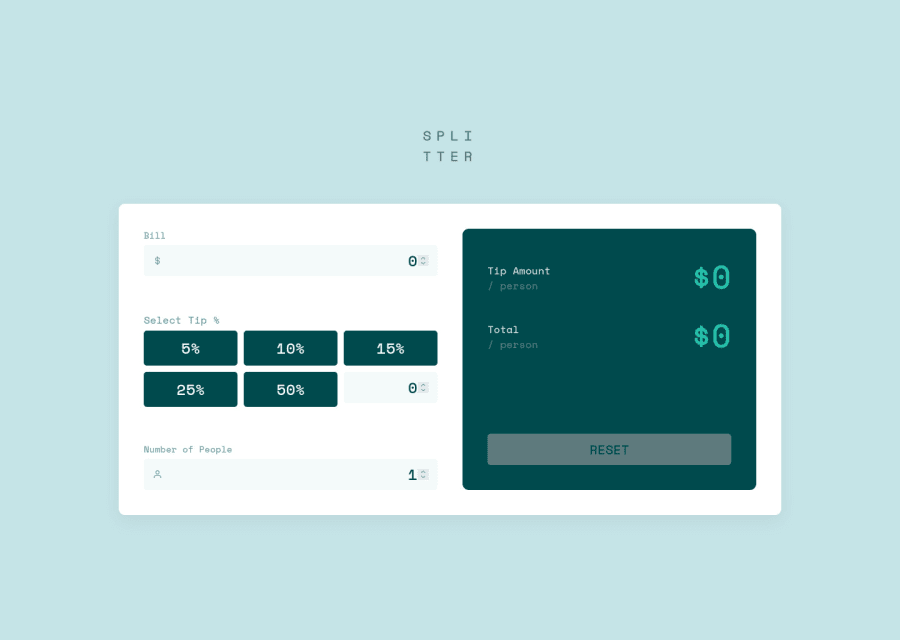
@Hazipan thank you for your reply ! These are good points. I changed my code to have no initial value inside my inputs, which improves UX as you said (totally agree !). I also added some space around the project and decreased margins on smaller screens. Thanks for the good feedback ! :)
