


This looks great, and the functionality works well. It also works really well with the keyboard, which a lot of submissions for this challenge miss, so very well done.
There's a few things that might be worth taking a look at.
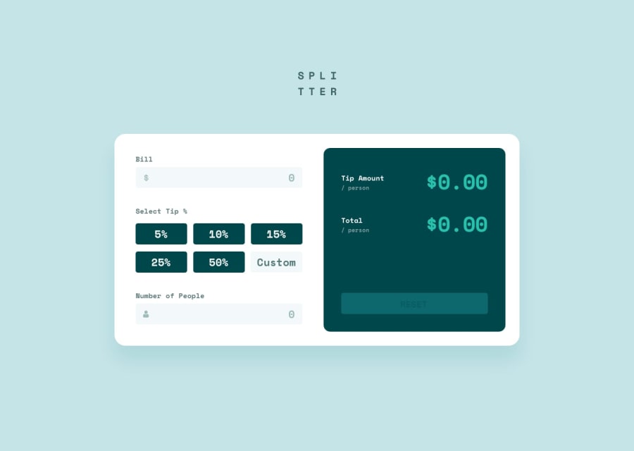
HTML heading structure: You are missing an h1, the app name would work as a good one here, visually hidden. And make sure then that the SVG logo has aria-hidden on it, at the moment it's announced as an empty image. The h3's and h2's are out of order. The final calculated figures should not be headers. So you could make the 'tip amount / person' and 'total / person' into h2's. Or you could make the numbers into an <output> element and use labels on them.
Focus-styling: The focus styling on the inputs is good. On the buttons it is too low contrast. You have a very dark button, with a dark outline. One way to solve this would be to add outline-offset so that your outline is spaced away from the button, and becomes easily visible.
Marked as helpful
@artemmatiushenko1
Posted
@AlexKMarshall Just have solved some of issues you've mentioned. Thanks for the feedback!
