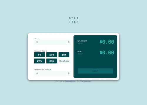
Skip to content
  • Unlock Pro
  • Log in with GitHub
Solution
Submitted over 1 year ago

Tip Calculator using HTML, CSS, & Javascript

Benhemin•180
@Benhemin
A solution to the Tip calculator app challenge
View live sitePreview (opens in new tab)View codeCode (opens in new tab)

Solution retrospective


I want my screen size changes to be smoother and for the proportions to remain the same. What is the best practice for handling different screen sizes and for dynamic resizing of elements?

When using the figma files for project designs, I can see the exact pixel dimensions for different screen sizes (mobile, desktop), how can I use those values and handle screen size changes easily?

Code
Select a file

Please log in to post a comment

Log in with GitHub

Community feedback

  • Kristina•300
    @frontend-en
    Posted over 1 year ago

    Hello, I hope my tips help you.

    1. No processing errors if 0 people
    2. If there are 0 people, then in tip NaN
    3. When you hover the mouse over the input, the layout moves. Try setting transparent borders by default
    4. It's good to write JS in a separate file
    5. var - considered an obsolete way to declare a variable. Use let and const
    6. Adding inline style is considered not a very good practice

Join our Discord community

Join thousands of Frontend Mentor community members taking the challenges, sharing resources, helping each other, and chatting about all things front-end!

Join our Discord

Stay up to datewith new challenges, featured solutions, selected articles, and our latest news

Frontend Mentor

  • Unlock Pro
  • Contact us
  • FAQs
  • Become a partner

Explore

  • Learning paths
  • Challenges
  • Solutions
  • Articles

Community

  • Discord
  • Guidelines

For companies

  • Hire developers
  • Train developers
© Frontend Mentor 2019 - 2025
  • Terms
  • Cookie Policy
  • Privacy Policy
  • License

Oops! 😬

You need to be logged in before you can do that.

Log in with GitHub

Oops! 😬

You need to be logged in before you can do that.

Log in with GitHub

How does the accessibility report work?

When a solution is submitted, we use axe-core to run an automated audit of your code.

This picks out common accessibility issues like not using semantic HTML and not having proper heading hierarchies, among others.

This automated audit is fairly surface level, so we encourage to you review the project and code in more detail with accessibility best practices in mind.

How does the CSS report work?

When a solution is submitted, we use stylelint to run an automated check on the CSS code.

We've added some of our own linting rules based on recommended best practices. These rules are prefixed with frontend-mentor/ which you'll see at the top of each issue in the report.

The report will audit all CSS, SCSS and Less files in your repository.

How does the HTML validation report work?

When a solution is submitted, we use html-validate to run an automated check on the HTML code.

The report picks out common HTML issues such as not using headings within section elements and incorrect nesting of elements, among others.

Note that the report can pick up “invalid” attributes, which some frameworks automatically add to the HTML. These attributes are crucial for how the frameworks function, although they’re technically not valid HTML. As such, some projects can show up with many HTML validation errors, which are benign and are a necessary part of the framework.

How does the JavaScript validation report work?

When a solution is submitted, we use eslint to run an automated check on the JavaScript code.

The report picks out common JavaScript issues such as not using semicolons and using var instead of let or const, among others.

The report will audit all JS and JSX files in your repository. We currently do not support Typescript or other frontend frameworks.

Oops! 😬

You need to be logged in before you can do that.

Log in with GitHub