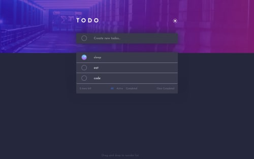
Todo app using ReactJs and Sortable JS

Solution retrospective
I haven't figure out how to deal with number of tasks if it exceeds the screen, any idea with that?
Tell me if there's any problem with the solution or give me some advice in coding.
Thank you for your time!
Please log in to post a comment
Log in with GitHubCommunity feedback
- @miroslavdurin
Hello and congratulations on completing this solution.
I would suggest that you add a class
.scrollif a list is longer than 9, or whatever number you like. You can change container div inside ofToDoList.jsto something like this:<div className={`container ${theme?"dark-theme":"light-theme"} ${list.length >= 9 && "scroll"}`}Inside
Main.scssyou can change to this:.container { @media (max-width:$mobile-width){ margin-top: 20px; } margin-top: 50px; max-height: 500px; /* You can put any height you like */ /* This class is added if list.length is bigger than 9 */ &.scroll { overflow-y: scroll; } /* Custom Scrollbar styles */ &::-webkit-scrollbar { width: 10px; cursor: pointer; } /* Track */ &::-webkit-scrollbar-track { box-shadow: inset 0 0 5px grey; border-radius: 10px; } /* Handle */ &::-webkit-scrollbar-thumb { background: var(--light-grayishblue-hover); border-radius: 10px; } /* Handle on hover */ &::-webkit-scrollbar-thumb:hover { background: var(--dark-grayishblue); } }I've added some styles for a scroll-bar too.
There is also issue with a check mark, which is not centered. I think that inside of
.todo-box imgyou can remove these 2 lines:right:2px; top:5px;And I've noticed that on a screen bigger than 1450px background-image is not full width. You can just add
background-size: containinside of.Appclass.Marked as helpful - @Dr-Wrong-Mo
I see the problem with your background exceeding your content. There are a few items you need to change.
The primary issue is that your div with the class "todo-box" has a position of absolute (I'll start referring to this as div.todo-box or just .todo-box). The property absolute position takes it out of the normal content flow. It is now positioned within the closest element that has position relative. If no ancestors have position relative, it becomes relative to the window.
I suggest you study CSS Flex-Box and CSS Grid for your layout properties.
The reason this is important is that your primary element (div.App) is now functionally empty.
Position absolute should be used sparingly, and almost never on your primary content.
Here is what I changed to make it work:
-
On div.todo-box, remove "position: absolute"
-
On div.App, change "height = 100vh" to "min-height = 100vh"
This will fix the problem where your background cuts off, but it will mess up the formatting for the child elements within div.todo-box. It will also make your todo-box align to the left side of the screen.
You can recenter your content by modyfing div.App as follows:
display: flex; justify-content: center; padding-top: 100px;
This will look better but your dark mode toggle will still have absolute positioning, which will move it to the top-right of the screen.
Remove position absolute (as well as the top and right properties). This will place it directly under your heading.
I would wrap the heading and the image in a parent div. Let's call it div.heading. So it would look like this:
<div class="heading"> <h1>todo</h1> <img .../> </div>Now the CSS
.heading { display: flex; justify-content: space-between; }
This has almost worked, but your hidden icon is blocking the shown icon from being where it wants. This is because you used "opacity: 0" to hide it. Opacity does not remove the item from the flow of the body. It only makes it less visible, but it is still taking up space. What you can do instead is apply "display: none". This will remove it from the flow of the body, allowing your shown icon to fit where you want.
Your icon will need to have some new properties applied to get it to have the shape you want.
A few other notes:
I didn't like the interface of needing to click on the checkbox in order to submit a new item. It would be better if I could press enter to submit the item, clear the input field, and place the cursor back into the now empty input field, ready for another new item.
Also, the positioning of the checkmark within the checkboxes is off. In my previous comment, I mentioned that you should study up on Flex-Box. This is another expample of where you could use Flex-Box (or Grid).
The project looks decent otherwise. Good job!
Marked as helpful -
- @AngeliqueDF
Hi Nguyễn, this solution looks great!
About your question, I think the best way to adapt the layout when there are a lot of tasks is to use CSS Grids for the layout.
I would apply the background on the
bodyelement, give it amin-height: 100vh;. Then usedisplay: grids;to create the layout. I haven't tried this yet but I think it could work.We have similar solutions and I didn't think of this case, so thanks!
Small feedback: can you make it so that we can add tasks by pressing the Enter key? It might be more intuitive than pressing the button.
Marked as helpful


Join our Discord community
Join thousands of Frontend Mentor community members taking the challenges, sharing resources, helping each other, and chatting about all things front-end!
Join our Discord