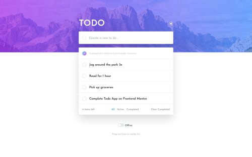
Submitted about 3 years agoA solution to the Todo app challenge
Todo Fullstack: Vue/Nuxt3, Tailwind-css, GraphQL
nuxt, tailwind-css, vue, graphql

@jpoechill
Solution retrospective
This was fun!
First time trying out Tailwind.css, Vercel, and GraphQL!
Also checkout the server-side application that runs on localhost..!
Code
Loading...
Please log in to post a comment
Log in with GitHubCommunity feedback
- @andreich1980
Your github repo has a wrong website link. It leads to interactive comments section demo.
You might want to make items clickable and toggle the completion status once user clicks on it. It's good for UX
On small resolutions filters section should go below the todo list. You made it as it should be on desktop.
Also need to remove blue outline on input focus. I believe it looks different on design (check
active statesimage).

Join our Discord community
Join thousands of Frontend Mentor community members taking the challenges, sharing resources, helping each other, and chatting about all things front-end!
Join our Discord