Tools like ChatGPT and techniques like the flex property

Solution retrospective
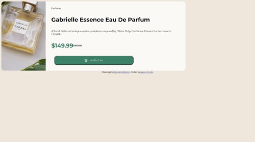
I'm most proud of my page looking similar to the example that was given to me because I was struggling with responsive design before this, but I am understanding as I practice. What I would do differently next time is slowing down and taking my time.
What challenges did you encounter, and how did you overcome them?Challenges I encountered was trying to get the correct font and colors, but I remembered about google fonts and the read.me file that's where you get the styles from and colors
What specific areas of your project would you like help with?Getting the responsiveness of the site to look more like example that was given to me I could work on that, but other than that just practice and I will continue to get better.
Please log in to post a comment
Log in with GitHubCommunity feedback
- P@bmeinert8
Good work completing the assignment. I have a couple suggestions to offer that you may find helpful.
-Adding semantic tags to your code. Semantic tags such as <main> , <section>, etc. help break the code up and make it more readable instead of using divs for everything. It also helps search engines identify your content.
For media queries I've always gone with dimensions of small medium and large. small being mobile, anything ranging up 576px or 36rem in width, medium being tablets or screens ranging from 577 to 991px or 36.063rem to 61.938, and large being larger tablet screens, laptops, and screen sizes up ranging from 992px or 62 rem. -work with mobile layouts first and then add as you go up. The less code you write the better off you are. For example create your entire design around the mobile layout then adding a media query to change the layout as the screen width expands past the mobile layout.
-Don't forget about your flex direction. By default flex direction is set to row. When you want your items to stack like in a mobile layout set your flex direction to column to get the contents of your container to stack properly and stay in the column direction for those different sized mobile layouts. before expanding to the row direction for the bigger screens.
A quick note on flexbox that helped me understand and grasp the responsiveness and what properties to place on which element is this. Parent elements recieve the properties of display (setting how the display is), gap( the space between the child items in the container), flex wrap (when flex direction is row, flex wrap will automatically move the items to the next line when space is needed.), flex-direction ( do you want your child items aligned in a row (default) or in a column.), Justify-content (this works on the main axis of what your flex direction is), and align-items(this works on the cross axis of what your flex direction is.). Child Items recieve flex-grow ( how much space an element will take up in a flex container relative to other flexible items in the same container.), flex-shrink(controls how much a flex item shrinks in relation to other flex items in the same container.) flex-basis (this acts like width).
Hope this helps you out a bit, keep building and don't give up. The more you create the easier this all becomes! good work so far.
Marked as helpful - P@2XG-DEV
Looks nice, but always remember to use properties such as max-width to keep your content the same size as the design.
Reseting defaults like button borders with border: 0 and using display flex, align-items:center and justify-content:center on the body to center your card.
Marked as helpful


Join our Discord community
Join thousands of Frontend Mentor community members taking the challenges, sharing resources, helping each other, and chatting about all things front-end!
Join our Discord