Not Found
Not Found
Not Found
Not Found
Not Found
Not Found
Not Found
Not Found
Not Found
Not Found
Not Found
Not Found
Not Found
Not Found
Not Found
Not Found
Not Found
Not Found
Not Found
Not Found

Submitted

Trying out Tailwind

Benja.min 740

@BenjaDotMin

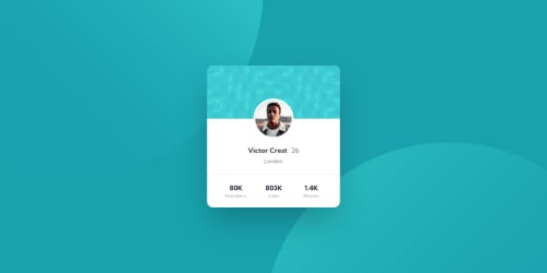
Desktop design screenshot for the Profile card component coding challenge

This is a solution for...

  • HTML
  • CSS
1newbie
View challenge

Design comparison


SolutionDesign

Solution retrospective


Still a bit iffy about Tailwind customisation, so decided to dive in with a real design.

I seem to spend longer fighting Tailwind to get precise dimensions to match the designs, than I would just writing basic scss. Any advice is appreciated.

Community feedback

@pikapikamart

Posted

Hey, nice work on this one. Layout in general looks great.

I don't know tailwind so can't give any info about it :> but for some other suggestions, here are some:

  • Always have a main element to wrap the main content of the site. For this use main tag on the .container selector.
  • Avoid using height: 100vh on a large container like the .container selector as this makes the element's height capped based on the viewport/screen's height. Instead use min-height: 100vh so that the element will expand if it needs to.
  • For those two huge-circle-backgrounds, it would be great to only use them as a value in the background property for the .container for example. This way, your html won't have extra img tags and you can remove the overflow: hidden from the body tag.
  • The card-patter-image is only a decorative image. Decorative images should be hidden for screen-reader at all times by using alt="" and aria-hidden="true" to the img tag or only aria-hidden="true" if the image is using svg.
  • Only use descriptive alt on images that are meaningful and adds content to the site otherwise hide the image for screen-reader users.
  • Person's image should be using the person's name as the alt value like alt="Victor Crest". Components like this where a person's information is presented, make sure to use their name as the person's img alt value.
  • The text "london" is not really a heading tag at all because by making it one, it doesn't add any information about the section's content. A p tag would be nice.
  • Those 3 information at the bottom part, if you think about the content, it is a list of information about the user, hence using a ul on it would be really great.
  • Also, each text-content in the information at the bottom, they don't need to use a heading tag, p tag for each of the text will be fine.

Aside from those, great job again on this one.

Marked as helpful

2
Benja.min 740

@BenjaDotMin

Posted

Excellent points there, thank you so much for the time and detail. I will bear all these in mind for the future.

1

Please log in to post a comment

Log in with GitHub
Discord logo

Join our Discord community

Join thousands of Frontend Mentor community members taking the challenges, sharing resources, helping each other, and chatting about all things front-end!

Join our Discord