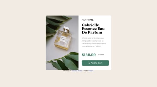
Trying Responsive Design

Solution retrospective
I had a hard time doing the desktop design for the first time.
I think that there is no fluent transition in my design because I use units like em and rem where I am not sure in my code.
If u want u can help me to use responsive units like a rem em vw vh . Thanks for eveyone .
Please log in to post a comment
Log in with GitHubCommunity feedback
- @AdrianoEscarabote
Hi MFA34, how are you?
I really liked the result of your project, but I have some tips that I think you will like:
1- Every page should have one main landmark
<main>. So replace the div that wraps the whole content with<main>to improve the accessibility. click here2- All page content should be contained by landmarks, you can understand better by clicking here: click here
We have to make sure that all content is contained in a reference region, designated with HTML5 reference elements or ARIA reference regions.
Example:
native HTML5 reference elements:
<body>
    <header>This is the header</header>
    <nav>This is the nav</nav>
    <main>This is the main</main>
    <footer>This is the footer</footer>
</body>
ARIA best practices call for using native HTML5 reference elements instead of ARIA functions whenever possible, but the markup in the following example works:
<body>
     <div role="banner">This is the header</div>
     <div role="navigation">This is the nav</div>
     <div role="main">This is the main</div>
     <div role="contentinfo">This is the footer</div>
</body>
It is a best practice to contain all content, except skip links, in distinct regions such as header, navigation, main, and footer.
Link to read more about: click here
2- Why it Matters
Navigating the web page is far simpler for screen reader users if all of the content splits between one or more high-level sections. Content outside of these sections is difficult to find, and its purpose may be unclear.
HTML has historically lacked some key semantic markers, such as the ability to designate sections of the page as the header, navigation, main content, and footer. Using both HTML5 elements and ARIA landmarks in the same element is considered a best practice, but the future will favor HTML regions as browser support increases.
Rule Description
It is a best practice to ensure that there is only one main landmark to navigate to the primary content of the page and that if the page contains iframe elements, each should either contain no landmarks, or just a single landmark.
Link to read more about: click here
Prefer to use
removerpxto have your page working better across browsers and resizing the elements properlyThe rest is great!!
Hope it helps...👍
Marked as helpful - @SrHatcher
hello @MFA34! Your result is great, don't worry! something that i learned by doing projects is that the harder they are the more you can learn from them. here are some suggestions and advices i can tell you:
if you start coding from mobile version you'll see that it'll be easier for you to code the desktop version. your CSS file reads the code from up to down, so you can write the mobile styles first without a "@media", and once you finished the mobile version you can create a "@media" for the desktop version.
Another thing i would suggest you is try to use less divs, look for a way to make the same project but using less of them, it's a very good practice that will increase your skills!
i would recommend you to use BEM to name your CSS classes and use descriptives names like "product-container" for example, that will make them easier to understand where they belong.
Also, when an element is inside another container, you can use percentage measures to make sure that the element inside fit the container, you can use "with: 100%" in the class "box-1" to make sure the element will always fit the container.
there's a difference between em and rem, i recommend you to read this https://www.geeksforgeeks.org/difference-between-em-and-rem-units-in-css/ . personally, i only use REM for fonts.
vw and vh (view-width and view-height) are usually used for containers that depend on the size of the device. so knowning this you can use them whenever you see it'll be useful.
you can see the projects from other users to compare and learn new things from them, i'm sure that will be very helpful. Nice work and keep going!
Marked as helpful - Account deleted
Hey, great job on this project!
Just checked out your card and it is responsive, just not 100% responsive.
To fix, do the following:
-
For the
widthin your container class it is better to use themax-width -
When using images that are different size for different breakpoints, its’ far more effective to use the <picture> element. By using this element not are able to use different size images, you can also save on bandwidth, meaning your content loads faster.
Syntax:
  <picture>
    <source media="(min-width: )" srcset="">
    <img src="" alt="">
  </picture>
Source:
https://www.w3schools.com/html/html_images_picture.asp
https://web.dev/learn/design/picture-element/
- To make you content accessible to your users, it is a best to use rem/em instead of px for your CSS property values. For media queries, I definitely suggest using em for them. By using px your assuming that every users browser (mobile, tablet, laptop/desktop) is using a font size of 16px (this is the default size on browser). Em's will help with users whose default isn't 16px, which can sometimes cause the your content to overflow and negatively affect your layout.
Sources:
https://betterprogramming.pub/px-em-or-rem-examining-media-query-units-in-2021-e00cf37b91a9
Happy Coding!
Marked as helpful -
- @correlucas
👾Hello @mfa34, Congratulations on completing this challenge!
Your solution its almost done and I’ve some tips to help you to improve it:
1.Use a CSS reset to avoid all the problems you can have with the default CSS setup, removing all margins, and making the images easier to work, see the article below where you can copy and paste this CSS code cheatsheet: https://piccalil.li/blog/a-modern-css-reset/
2.Add transitions to make the interaction smoother while the element gets hovered, you can use a value like
transition: all ease-in 0.5s.3.Using
<picture>you’ve more control over the elements and its better than using the product image as<img>orbackground-image. Look that for SEO and search engine reasons it isn't a better practice to import this product image with CSS since this will make it harder to the image. You can manage both images inside the<picture>tag and use the html to code to set when the images should change setting the devicemax-widthdepending of the device (phone / computer) Here’s a guide about how to usepicture:https://www.w3schools.com/tags/tag_picture.asp✌️ I hope this helps you and happy coding!


Join our Discord community
Join thousands of Frontend Mentor community members taking the challenges, sharing resources, helping each other, and chatting about all things front-end!
Join our Discord