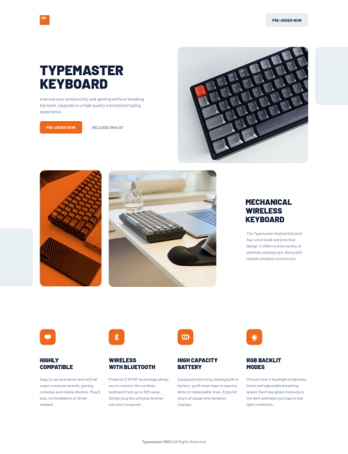
Typemaster pre-launch landing page grid solution

Solution retrospective
A few comments on this one: -Tried to keep the markup optimised for accessibility where I could, hopefully it shows. Would appreciate more tips on how to improve accessibility. Missing alt text is on purpose, I am lazy. -The images shrink too much when downscaling, this is probably due to my use of max sizes instead of pre defined ones or maybe just the way I implemented the images, atleast they work at the intended design sizes :D. Tips appreciated on this matter -I tried using grid for most of this even though some of it probably makes sense to use flex, that being said I still have a lot to learn about flex and grid both so we will see what I can do in the future. -Normally I would have made the buttons anchors but I actually just forgot and realised mid dev and just styled the hovers since this is a solo page project. Thanks for reading and checking out the solution.
Please log in to post a comment
Log in with GitHubCommunity feedback
No feedback yet. Be the first to give feedback on Xavier's solution.
Join our Discord community
Join thousands of Frontend Mentor community members taking the challenges, sharing resources, helping each other, and chatting about all things front-end!
Join our Discord