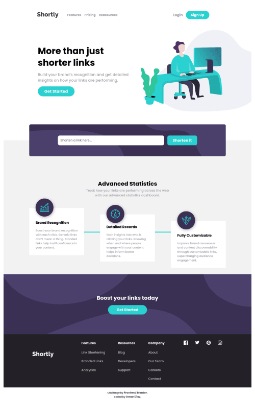
@PhoenixDev22
Posted
Hi Omar Díaz Hernández,
Congratulation on finishing this challenge. Great job on this one! I have few suggestions regarding your solution:
- You should use the headers in a chronological order. How you order headings dictates how a screen reader will navigate through them. As you go down a level, the number should increase by one, like a numbered list within an outline. You should have used
<h1>
forclass="main-cover__contents-heading"
and<h2>
forclass="footer-side__data__heading"
- Avoid creating duplicate content (duplicate navigation). You can style the same navigation in mobile and desktop differently using media queries. Practice like this can result in a poor user experience, when a visitor finds substantially the same content repeated within a set of search results.
- If you wish to draw an horizontal line which is only for decorative purposes , it is not needed to be announced by a screen reader. You should do so using appropriate CSS.
- Instead of using a generic div to wrap the navigation links , you put your links within an unordered list structure so that a screen reader will read out how many things are in the list to give visually impaired users the most information possible about the contents of the navigation. The same for the footer's links.
- The toggle element is added outside the nav, it would be better to be placed within the
<nav>
. As it is, assistive technology user won’t announce the button related to the<nav>
. And this is confusing and not good for the user.
Toggle Element:
- It’s not recommended to add event listener on non-interactive elements. You can use a
<button>
with type=”button”.
1- The button needs to have anaria-label
attribute or an sr-only
text that describes the button purpose. For example, you can have: aria-label='Mobile Navigation Trigger'
or 'Open Menu.’
2- Adding aria-expanded
to the button, that way the user will be able to know that the button content controls is expanded or collapsed. At first, it has the “false” as a value then you use JavaScript to change the value.
3- You should use aria-controls
attribute on the toggle element, it should reference the id
value of the <ul>
element.
- In
class="card-contents"
, you should never use<div>
and<span>
alone to wrap a meaningful content. Just keep in mind that you should usually use semantic HTML in place of the div tag unless none of them (the semantic tags) really match the content to group together. By adding semantic tags to your document, you provide additional information about the document, which aids in communication.
- look up a bit more about how and when to write alt text on images. Learn the differences with decorative/meaningless images vs important content For decorative images, you set an empty
alt
to it with anaria-hidden=”true”
to remove that element from the accessibility tree. This can improve the experience for assistive technology users by hiding purely decorative images for example.
- You should use the
<nav >
landmark to wrap the footer navigation. Then you should addaria-label=”secondary “
oraria-label=”footer”
to it. A brief description of the purpose of the navigation, omitting the term "navigation", as the screen reader will read both the role and the contents of the label.
- The
nav
element in the header could use anaria-label="primary"
oraria-label=”main”
attribute on it. The reason for this is that, you should add thearia-label
for a nav element if you are using the nav more than once on the page.You can read more in MDN
- The social links wrapping the svgs must have
aria-label
orsr-only
text indicate where the link will take the user. Then you setaria-hidden =”true”
andfocusable=”false”
to the svgs to be ignored by assistive technology .
Hopefully this feedback helps.
Marked as helpful
@0marD
Posted
@PhoenixDev22 Wow Thank you very much for all your contribution Honestly, the correct use of labels have been a headache for me Thank you for giving me such a detailed explanation
@PhoenixDev22
Posted
@0marD Glad to help. Happy coding!