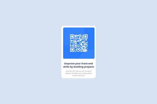
Submitted over 1 year agoA solution to the QR code component challenge
Use of media queries to design different devices responsive designs.
accessibility, pure-css

@noreenfatima775
Solution retrospective
What are you most proud of, and what would you do differently next time?
I done this with modular aproach.it seem good. Next time I prefer to use it.
What challenges did you encounter, and how did you overcome them?I face challenge to fulfil this design. But it done with setting container width equal to image.
What specific areas of your project would you like help with?The concrete responsiveness.
Code
Loading...
Please log in to post a comment
Log in with GitHubCommunity feedback
No feedback yet. Be the first to give feedback on noreenfatima775's solution.
Join our Discord community
Join thousands of Frontend Mentor community members taking the challenges, sharing resources, helping each other, and chatting about all things front-end!
Join our Discord