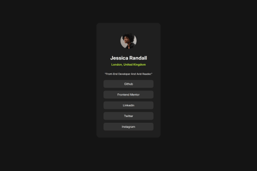
use this simple and practical card to introduce yourself to the world.

Solution retrospective
a good friend @thisisharsh7 told me to not use vh for the body, i tried different units and now i am more satisfied with the outcome. for the next project i may use a different approach for responsiveness. and start with mobile first and then i'll go to desktop mode.
What challenges did you encounter, and how did you overcome them?i've read a documentation about adding fonts to root, that a lovely friend @haquanq suggested. https://gwfh.mranftl.com/fonts you can find all about font in here.
What specific areas of your project would you like help with?first i set the width of the card to 380px, and i set the width for mobile to 375px, the problem is here: in a particular area (between 375 and 380px) the card sticks to the edges and there is just no space around the card. any idea or any different approaches are welcomed :)
Please log in to post a comment
Log in with GitHubCommunity feedback
No feedback yet. Be the first to give feedback on Ghazal Mahmoodi's solution.
Join our Discord community
Join thousands of Frontend Mentor community members taking the challenges, sharing resources, helping each other, and chatting about all things front-end!
Join our Discord