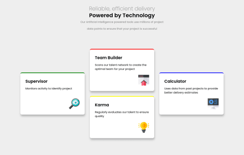
Used CSS grid, be sure to play around with the icons, added animations

Solution retrospective
I was trying to make the header texts like the figma design (square and on each other) but couldn't. I use white-space: nowrap; for the h1 and the reliable text so they won't wrap and pit the max width to 370px then set the left and right margin to auto so I can has some space by the left and right and the h1 and reliable text won't break but it affected the width of the mobile display (there was extra width), I ended up leaving it the way it is with no margin at the left and right, does anyone have any idea on how I can achieve what I wanted to achieve? Asides that, I think this came out well. Be sure to play around with the little image icons. ;)
Please log in to post a comment
Log in with GitHubCommunity feedback
No feedback yet. Be the first to give feedback on Chukwudobe Micah Chinedu's solution.
Join our Discord community
Join thousands of Frontend Mentor community members taking the challenges, sharing resources, helping each other, and chatting about all things front-end!
Join our Discord