


Hi, I'd recommend you either have a go at this without bootstrap, or try to only use bootstrap with hardly any css of your own. At the moment it looks to me like your styles will be fighting the bootstrap styles.
In general principles,
-
build mobile first. That's what bootstrap does, so. You shouldnt have any max-width media queries.
-
To get everything looking right on mobile, shrink your viewport down small and use bootstrap classes only as needed to get it looking right
-
Start to enlarge the viewport. As soon as it looks like there's room for the layout to adjust, add breakpoint specific bootstrap classes
-
Keep doing that until you get to a largest screen screen size
I think you will learn much better if you do some smaller challenges with no bootstrap and then return to this later. Then you will have a much better understanding of what's needed.
But if you are really keen to use bootstrap now, follow the process above.
Best of luck with it
@rohitdubey1352
Posted
@grace-snow sure I will follow your instructions and now onwards I only use bootstrap. Yeah, 😆 I think u r right about my style (fighting). Thanks for giving me feedback : )
@rohitdubey1352
Posted
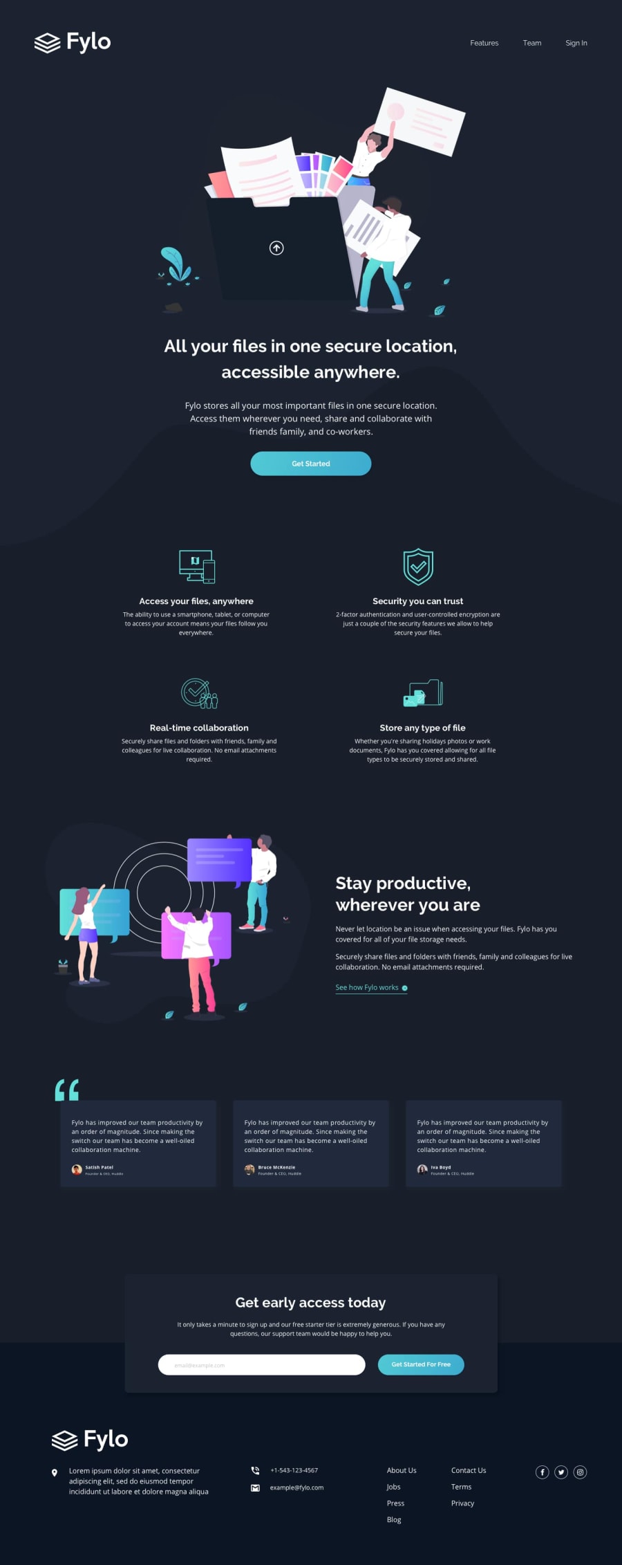
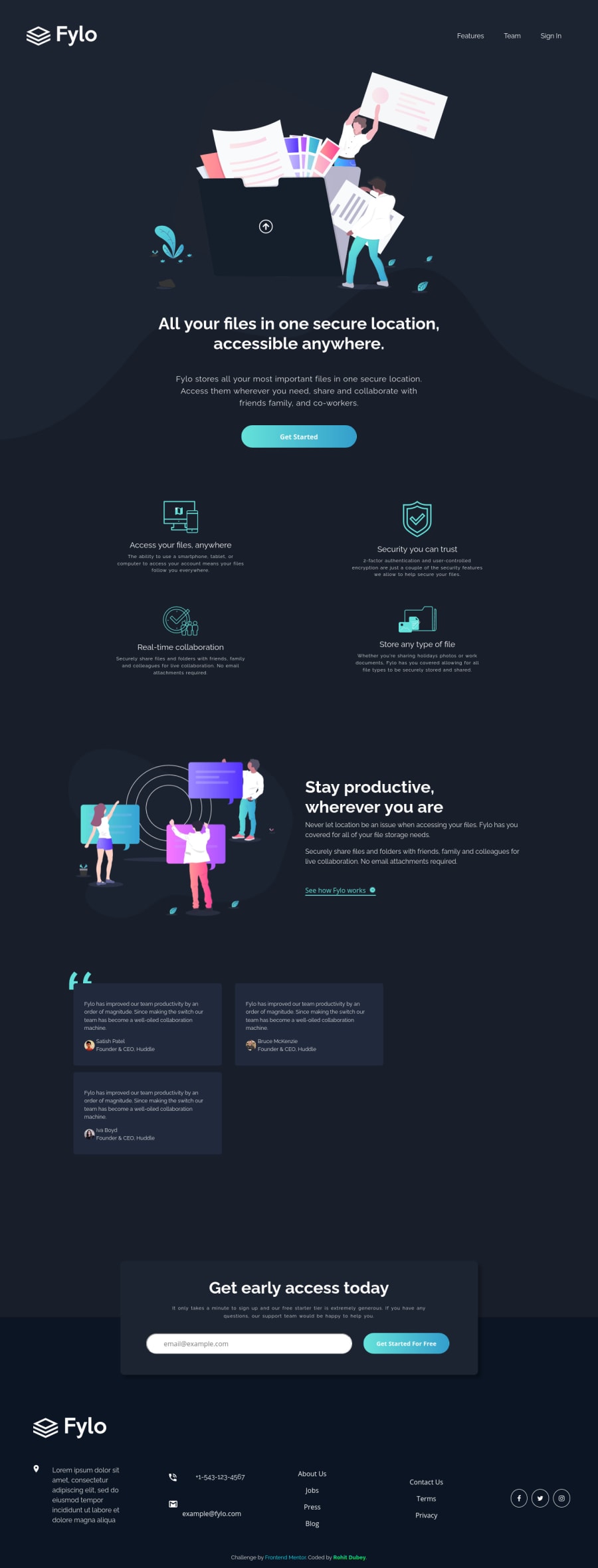
@grace-snow Hey, finally I made it into the mobile version check out and give some feedback if u wish : )

