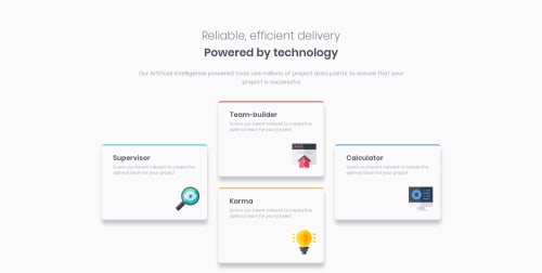
Submitted about 5 years agoA solution to the Four card feature section challenge
Used CSS grids for desktop and tablet, then flexbox for mobile

@Sumner-David
Solution retrospective
I had issues with making the grids fully responsive for tablet and mobile. For some reason i couldn't get the rows to auto fit. They would just stick to 2 columns and the 2nd column would just shrink while the 1st column would stay in the min width.
I resorted to switching to flexbox to get the mobile right.
If you see a way i could have done it better with grids, please let me know
Code
Loading...
Please log in to post a comment
Log in with GitHubCommunity feedback
No feedback yet. Be the first to give feedback on David Sumner's solution.
Join our Discord community
Join thousands of Frontend Mentor community members taking the challenges, sharing resources, helping each other, and chatting about all things front-end!
Join our Discord