


@janegca
Posted
Hi Tamarchika, your design for the desktop size is quite well done. The trick with responsive design is to
(a) plan out which visible items will need grouping for the larger design and structure your HTML accordingly (b) start writing the design for the mobile first, once that is working (c) add progressive enhancements and/or media queries to get it working in the larger screen sizes
Although I find myself constantly flipping between the two each time I complete a new component (don't like being surprised at the end). Check out Kevin Powell's Responsive Design Made Easy video and/or other videos on his site, find he usually explains things pretty clearly.
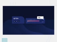
Noticed your background graphic is a bit misplaced. Instead of sizing it with auto, try using the (x,y) positioning: you want the full width (100%) but only half the height (50%). Then for position you want it stuck to the bottom (0%) and the full width or all the way to the right (100%).
Hope that's of some help. Happy coding 😄
@Tamarchika
Posted
@janegca thanks very much ! I ll try to use ur tips for the next time.. good luck!
