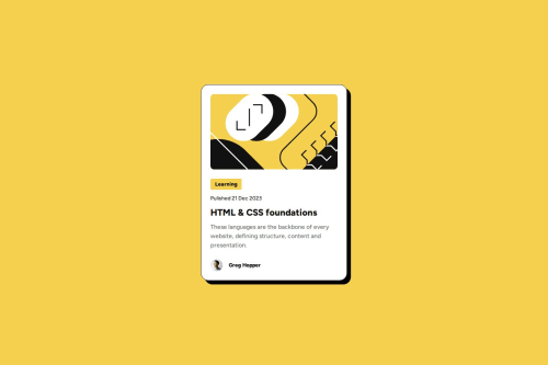
Used flex box for this project instead of grid

Solution retrospective
I'm really proud of how I structured the layout using flexbox, especially with how I used it to handle different sections like the main content and author box. It made aligning and spacing elements much easier and more responsive. I did end up using flexbox inside a flexbox a few times to manage the layout, which worked out well for the design.
That said, I'm always looking for ways to reduce my CSS footprint. If you have any suggestions on how I can make the code more efficient or cut down on some of the repeated flexbox usage, I'd love to hear them!
What specific areas of your project would you like help with?I’ve used flexbox quite extensively (even flexbox inside flexbox) and I’d love suggestions on how to simplify or reduce the amount of CSS I’m using while keeping the layout intact.
Please log in to post a comment
Log in with GitHubCommunity feedback
No feedback yet. Be the first to give feedback on V.S Karthik Tirumalasetty's solution.
Join our Discord community
Join thousands of Frontend Mentor community members taking the challenges, sharing resources, helping each other, and chatting about all things front-end!
Join our Discord