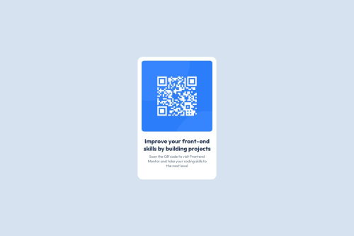
Used flexbox to center the card. Border-radius to add rounded corners

Solution retrospective
- Using flexbox to center the card.
- Containing the image inside it's Parent container & not letting it overflow
- I would like to use relative values like (rem or em) next time to add padding and margin
- The challenging part was to contain the image in it's Parent container and not let it overflow.
- I would like to know when to use relative values like(em, rem, %)
Please log in to post a comment
Log in with GitHubCommunity feedback
- P@Islandstone89
Hi, good job! The centering of the card is spot on :)
Here are some suggestions I hope you find helpful:
HTML:
-
<main>holds all of the main content on a page. As a card would likely not be the only component on a page, I would remove.cardonmainand wrap the card content in a<div class="card">inside of<main>. -
I would change the heading to a
<h2>- a page should only have one<h1>, reserved for the main heading. As this is a card heading, it would likely not be the main heading on a page with several components.
CSS:
- Make a habit of including a modern CSS Reset at the top of your stylesheet. At least include the following snippet:
*,
*::before,
*::after {
  box-sizing: border-box;
}
MDN has good articles about the CSS Box Model and the
box-sizingproperty.-
I recommend adding a bit of
padding, for example16px, on thebody, to ensure the card doesn't touch the edges on small screens. -
Remove all widths and heights in
px. We rarely want to give a component a fixed size, as we need it to grow and shrink according to the screen size. -
We do want to limit the width of the card so it doesn't get too wide on larger screens. To solve this issue, give the card a max-width of around 20rem.
-
font-sizemust never be in px. This is a significant accessibility issue, as it prevents the font size from scaling with the user's default browser setting. Use rem instead. -
Paragraphs have a default value of
font-weight: 400, so there is no need to declare it. -
On the image, add
height: autoand changewidthtomax-width: 100%- the max-width prevents it from overflowing its container. Without this, an image would overflow if its intrinsic size is wider than the container.max-width: 100%makes the image shrink to fit inside its container.
Marked as helpful -
- Account deleted
Great solution, well done!
rem is generally better for responsive layouts, especially for controlling font sizes, margins, paddings, and widths. It scales consistently based on the root font size, making your layout more predictable.
Another quick take: Avoid fixed heights unless you really need them they can make components overflow or behave unpredictably on smaller screens.
Marked as helpful

Join our Discord community
Join thousands of Frontend Mentor community members taking the challenges, sharing resources, helping each other, and chatting about all things front-end!
Join our Discord