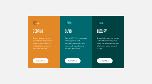
@grizhlieCodes
Posted
I wrote a juicy reply and accidentally hit the back button on my mouse βΉ
ALRIGHT. Everything is pure opinion so please don't take it as 'gospel'.
I get the distinct feeling you will LOVE structuring your css with SASS/SCSS; Mostly because I see a lot of order in your code and I can only assume you want to continue in this trajectory (compliment!).
Pure HTML/CSS comments:
You don't need to go overboard, besides just naming sections. Mostly your class names and semantic HTML will do the heavy lifting for you here. Adding a 'title' to sections of your code can be nice. Just helps your brain adjust and filter for/through content. But adding anymore just adds complexity in simple projects OR in projects that are already structured well.
If we take this as an example: <section class="homepage-hero"></section>
I think we can safely say that this doesn't require additional commenting besides a nice 'hero' comment. You can be nice and visual with this:
< -- HERO -->
This just helps your brain adjust.
< -- This is my hero section for the home page, more info bla bla -->
This doesn't - as your content is already 'clear enough'.
SCSS:
Then we get to SCSS. In this wonderful world we can really place bits of our code into different folders. I'll focus on 1 specific example for now from my Designo project.
I structured my styling as such:
index.html
style
---1-helpers
---2-base
---3-layout
---4-components
---5-pages
As you can see, it's slightly different than how you would structure a vanilla-css project (I don't know if you have dabbled in SASS yet so I'm just being descriptive, apologies for the caution and possibly over-explanation).
Anyhow - I added some commentary to a few files, mostly located within the 3-layout
folder.
This one was important for me:
/* ./style/3-layout/_sharedMain.scss */
//Every page will use the below main template-columns.
//The logic here is to use columns as width and margin.
main {
height: auto;
display: grid;
grid-template-columns: 2.4rem 1fr 2.4rem;
@include breakpoint(tablet){
grid-template-columns: 3.9rem 1fr 3.9rem;
}
@include breakpoint(desktop){
grid-template-columns: 100%;
}
}
The purpose of this comment was singular: If I come back to the project in the future, I should be aware that every single page in the project will use this styling in the <main> element, without exception.
//My entire website will be a max width of 1111px. All my content will
//essentially be 100% width.
//Body happens to be a flex-parent for:
//Header, Main & Footer
//..code
Purpose of this comment was to remind me that my content can be 100% width and I don't need to concern myself with worrying about "what if my width won't match the original design because it's too wise bla bla bla".
I think I blabbed on enough. I was TRYING to illustrate the difference between simple code and when things can get a bit complicated if you have some sort of system/architecture for a project.
I recommend Designo to anyone who wants to get into SASS and get organised. Believe it or not I did this project TWICE. I was so unhappy with how I structured my code in the first run that I rewrote it. It was such a productive learning experience, I can't recommend it enough.
And it's ok to take your time with this one. Lots of time. There is so much opportunity to learn from and improve in Designo for HTML/CSS/SCSS/SCSS architecture.
And sharing code across pages!!! Designo is great for getting you to think in components π
I hope that was helpful/informative in some small way. Any questions - let me know....
Happy coding!
Marked as helpful