Skip to content
  • Unlock Pro
  • Log in with GitHub
Solution
Submitted 2 months ago

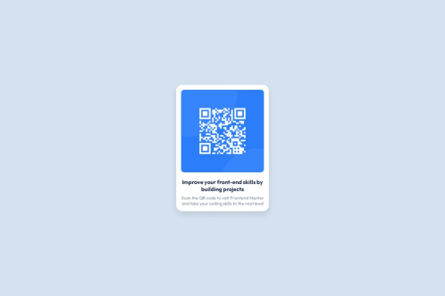
Used HTML and CSS Flexbox to center and style a responsive QR card.

helloamresh•70
@hellomresh
A solution to the QR code component challenge
View live sitePreview (opens in new tab)View codeCode (opens in new tab)

Solution retrospective


What are you most proud of, and what would you do differently next time?

I’m most proud of successfully centering the card using Flexbox and replicating the design with accurate spacing, colors, and typography. It was my first time fully implementing a UI from a design, and seeing it match the original made me feel confident.

Next time, I’d focus more on making the layout responsive across various screen sizes and explore using CSS variables for better consistency. I'd also try organizing the CSS into reusable utility classes for cleaner code.

What challenges did you encounter, and how did you overcome them?

One of the main challenges was centering the card both vertically and horizontally on the page. I initially struggled with traditional methods like margin and positioning, but after learning about Flexbox, I was able to center the content using display: flex, justify-content: center, and align-items: center. I also had difficulty with spacing and alignment inside the card, which I fixed by carefully adjusting padding and using text-align: center.

What specific areas of your project would you like help with?

I’d like help improving the responsiveness of my layout so it looks good on all screen sizes. I'm also interested in learning best practices for organizing CSS, especially how to write cleaner, more reusable styles. Additionally, feedback on how to improve accessibility (like proper use of alt text or ARIA roles) would be really valuable.

Code
Select a file

Please log in to post a comment

Log in with GitHub

Community feedback

  • P
    Ed Johnson•170
    @edjohnsondev
    Posted 2 months ago

    This is looking really good!

    When organising your CSS, you have two main options for managing things like colours and spacing:

    • reusable classes: You could setup classes for the 2 different font styles, and then apply them to the HTML wherever needed.

    • Root-level variables: Setting up root variables means you tweak a value in one place and the change ripples through your whole stylesheet.

    It's also handy when setting these up to follow the Design System, in the Figma file under pages you'll find this. By naming your variables or utility classes exactly as they appear, if something is changed you can quickly go through and find them without having to look for the hex code etc..

    So for example:

    :root { --slate-900: #1F314F; }

    Then you can use these like

    .card h2 { color: var(--slate-900); }

    I hope this helps!

    Marked as helpful
  • 潘宏福•10
    @panhongfu
    Posted 2 months ago

    n

Join our Discord community

Join thousands of Frontend Mentor community members taking the challenges, sharing resources, helping each other, and chatting about all things front-end!

Join our Discord

Stay up to datewith new challenges, featured solutions, selected articles, and our latest news

Frontend Mentor

  • Unlock Pro
  • Contact us
  • FAQs
  • Become a partner

Explore

  • Learning paths
  • Challenges
  • Solutions
  • Articles

Community

  • Discord
  • Guidelines

For companies

  • Hire developers
  • Train developers
© Frontend Mentor 2019 - 2025
  • Terms
  • Cookie Policy
  • Privacy Policy
  • License

Oops! 😬

You need to be logged in before you can do that.

Log in with GitHub

Oops! 😬

You need to be logged in before you can do that.

Log in with GitHub

How does the accessibility report work?

When a solution is submitted, we use axe-core to run an automated audit of your code.

This picks out common accessibility issues like not using semantic HTML and not having proper heading hierarchies, among others.

This automated audit is fairly surface level, so we encourage to you review the project and code in more detail with accessibility best practices in mind.

How does the CSS report work?

When a solution is submitted, we use stylelint to run an automated check on the CSS code.

We've added some of our own linting rules based on recommended best practices. These rules are prefixed with frontend-mentor/ which you'll see at the top of each issue in the report.

The report will audit all CSS, SCSS and Less files in your repository.

How does the HTML validation report work?

When a solution is submitted, we use html-validate to run an automated check on the HTML code.

The report picks out common HTML issues such as not using headings within section elements and incorrect nesting of elements, among others.

Note that the report can pick up “invalid” attributes, which some frameworks automatically add to the HTML. These attributes are crucial for how the frameworks function, although they’re technically not valid HTML. As such, some projects can show up with many HTML validation errors, which are benign and are a necessary part of the framework.

How does the JavaScript validation report work?

When a solution is submitted, we use eslint to run an automated check on the JavaScript code.

The report picks out common JavaScript issues such as not using semicolons and using var instead of let or const, among others.

The report will audit all JS and JSX files in your repository. We currently do not support Typescript or other frontend frameworks.

Oops! 😬

You need to be logged in before you can do that.

Log in with GitHub

Oops! 😬

You need to be logged in before you can do that.

Log in with GitHub