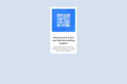
Used HTML, CSS, and Flexbox to build and center a responsive card.

Solution retrospective
Proud of the clean Flexbox layout. Next time, I’d enhance responsiveness and use a CSS framework.
What challenges did you encounter, and how did you overcome them?I struggled with centering the card layout at first, but I overcame it by using Flexbox, which made alignment much easier and responsive.
What specific areas of your project would you like help with?I’d like help with improving the responsiveness of my card layout. Right now, the .cards container has a fixed width (300px), which doesn’t adapt well on smaller screens. How can I make it more flexible using percentages or media queries? Also, is there a better way to vertically center the card within the viewport besides using margin: 5em auto?
Please log in to post a comment
Log in with GitHubCommunity feedback
No feedback yet. Be the first to give feedback on Matthew0-be's solution.
Join our Discord community
Join thousands of Frontend Mentor community members taking the challenges, sharing resources, helping each other, and chatting about all things front-end!
Join our Discord