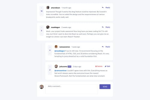
Used NextJs React CSS Grid , FlexBox, Mobile-first workflow

Solution retrospective
Hi everyone,
I would appreciate any feedback you can offer.
Thanks.
Please log in to post a comment
Log in with GitHubCommunity feedback
- @pikapikamart
Hey, really nice work on this one. Overall, the layout for both desktop and mobile state looks really great. The reply also works great as well the upvote and downvote.
For some suggestions, here are some:
- If you try to click the first upvote of the first comment, you can't point to it , I think it is because of the
h1being sr-hidden. You can addclip: rect(0 0 0 0);on theh1to fix it. - For each of the upvote and downvote, currently it doesn't have any informative text inside it and
+or-alone is not enough. What you can do is that, add ansr-onlytext inside it to which could bedownvote commentandupvote comment, depends on where it is placed. - Also, I would suggest changing the html placement for each of the post. The post's body should be placed before the ratings so that when a user navigates on the component, they will traverse the user, the user's post before the rating. Because it would be confusing to first traverse the upvotes/downvotes when the content is not first reviewed by the user.
- Adding an
aria-liveattribute on the element wrapping the counts so that assistive tech will announce the update to the user on what happened. You can add extra text if you want, ansr-onlytext. Also, you could change thespanto justptag. - For each of the person's
img, since their name is already present, it would great to use their name as thealtvalue since it makes sense to do so. - Actually, if this were a real app, each person would be a hyperlink right. Maybe making them wrapped inside
atag? Each person'simgand name. Could be right. - Whenever you wrap a text, always use meaningful elements and not
div. Changing all thosedivthat wraps a text should be replaced byptag. - For the reply
button, the arrow-svg should have anaria-hidden="true"attribute on it since it is only a decorative image. - Again for the reply
button, addingaria-expandedattribute would make it more accessible. This way, when a user toggles it, assistive tech will inform the user that it shows or expanding something. - For the reply
form, using the user's name on the user's avataraltattribute would be nice. - Adding
labelfor thetextareawould be great. Remember to always addlabelfor eachinputortextareaelement. This way, when a user is using a different language, those label text will be changed as well since attribute's data is static, theplaceholderwon't be translated. Thelabelwill besr-onlyon this one. - There is a confusing part on the
textarea. Initially, it should be empty right because a user is still not typing anything, but since you are already adding the@_nameon field, a user can press thereplyto send that reply even if they haven't add anything on thetextareaand it will be much confusing since it is usingrequiredand to be honest, I can't think of an approach on this one, so maybe just letting you know about this? :>> - When clicking now either the reply or cancel
buttonit would be nice again to have anaria-liveelement or maybe you can add a toast-notification on this one. The toast's text-content will vary on the user's choice, it could be likesuccessfully replied to {person's name}or could be likereply cancelled. Just remember to add anaria-live="polite"on the element so that it will be announced. - When toggling the delete
button, it would be nice to set the focus to the modal. This way, user will immediately be informed on what is the content. Right now, if you use keyboard to toggle the delete, then tab again, the user won't traversed on the modal like what it should do. So when a user toggles the delete, add thearia-expandedattribute then shift the focus in the modal, so that if they tab again, they will tab inside the modal. Another feature to add as well is to have a trap focus inside the modal. Meaning they can only tab on the two options, this way the user won't be confused on where they are at now. - To be honest, there are lots of added
aria-liveon this one or some toast, for the successfully deleting a reply and adding a comment as well.
Just in general, if there are lots of state in your app that requires to send an update to the user, an
aria-livewould be nice or sometimes changing the focus on the pop-up element is really nice.Aside from those, great job again on this one.
Marked as helpful - If you try to click the first upvote of the first comment, you can't point to it , I think it is because of the
Join our Discord community
Join thousands of Frontend Mentor community members taking the challenges, sharing resources, helping each other, and chatting about all things front-end!
Join our Discord