
Code
Please log in to post a comment
Log in with GitHubCommunity feedback
- P@SabineEmden
Hi there! 👋 Good job on completing the challenge.
All in all, you code looks pretty good. You could simplify it by using fewer HTML elements and default styling in place of CSS flexbox for the card component. Here are some points you may want to consider:
HTML
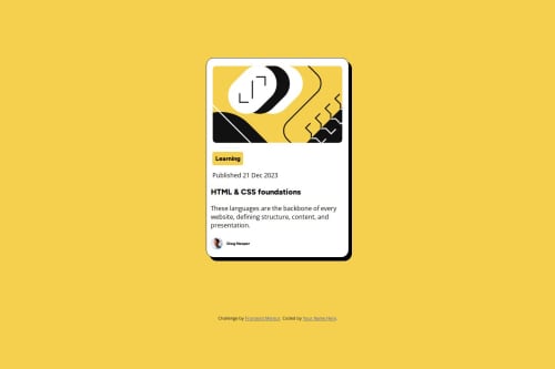
- The image on top of the card is purely decorative. The card looks better with it there, but it doesn’t add anything to the content. Decorative images should have an empty
altattribute (alt=””). - You wrapped both images in a
<figure>element. I definitely wouldn’t use<figure>for a decorative image. I also wouldn’t use it for the author avatar. In my opinion, an<img>element for the avatar and a<p>element for the author’s name, wrapped in a<div>for styling is all you need. If you want to use<figure>, I would use<figcaption>for the author’s name instead of<p>. - You have two
<section>elements and a<footer>on the card. I recommend removing all three. You don’t need them for styling, and in my opinion they don’t have enough content for a section or a footer. - You used a heading element with
class=“box-learning”. In my opinion, this is not a heading. I would replace it with a<p>element as a more generic block-level text element. - You used
<br>elements in the paragraph with the description of the blog post. Only use the line break element if the division of lines is significant, for example in a poem or an address. - Don’t forget to customize the attribution at the bottom of the page. I would replace
<div class=“attribution”>with a<footer>element, replaceYour Name Herewith your name, and add a link either to your personal website or your Frontend Mentor profile.
CSS
- I like your use of CSS custom properties and how you used
remandpx. Well done! - You used two font families, Figtree and Open Sans. I’m pretty the design uses only Figtree.
- You used the
<main>element for the card component and centered it horizontally withmargin: 15rem auto. I would wrap the card in a<div>inside<main>and use flexbox to center it. - You gave the card component
widthandheightinrem. All it needs ismax-width. Settingheightfor a container with text is generally not a good idea. - Add some padding to the card component.
- You don’t need
display: flexon the card component itself, only on the element that wraps the avatar and the name. - You can use
width: fit-contentfor.box-learning, then you don’t needtext-align: center. - Move the CSS styling for the attribution from
index.htmlto your style sheet. - I’m curious why you used
@charset "UTF-8”at the top of your stylesheet. I have never seen this before.
I hope this helps. Let me know if you have any questions.
Happy coding! 😎
- The image on top of the card is purely decorative. The card looks better with it there, but it doesn’t add anything to the content. Decorative images should have an empty

Join our Discord community
Join thousands of Frontend Mentor community members taking the challenges, sharing resources, helping each other, and chatting about all things front-end!
Join our Discord