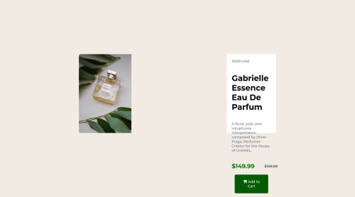
Skip to content
  • Unlock Pro
  • Log in with GitHub
Solution
Submitted over 2 years ago

using css flexbox

Enis67•140
@Enis67
A solution to the Product preview card component challenge
View live sitePreview (opens in new tab)View codeCode (opens in new tab)

Solution retrospective


need some help

Code
Select a file

Please log in to post a comment

Log in with GitHub

Community feedback

  • C H A R A N 🎯•2,670
    @0xabdul
    Posted over 2 years ago

    Hey there ! 👋 Congratulations you finished the Product preview card...🎉

    • some suggestions for you improve your code

    Html 🏷️:

    • for Accessibility reports you using the and div tag to wrap the whole html code and put attribute role="main" is correct way 🎯 and using the header tag those all are problem to occur the Accessibility reports for example...
    <body>
    <div class="container" role="main">
    
    //Whole html code
    
    <h1> </h1>
    <h2> </h2>
    <h3> </h3>
    //by ordering using the header tag
    
    </div>
    </body>
    
    • In CSS 🎨:
    • the result summary card the not center aligning because you not using the felx center and height width in body section etc.. so the reason error occurred in the project for example
    body {
    display : flex;
    align-items: center;
    justify-content : center;
    height : 100vh
    max-width : 100%;
    overflow-x : hidden;
    }
    
    • I Hope it's useful for you and wating for your next project ❤️
    • Happy Coding 😃
  • Hassia Issah•50,390
    @Hassiai
    Posted over 2 years ago

    Replace <div class="row"> with the main tag to fix the accessibility issues. click here for more on web-accessibility and semantic html

    There is no need to give .row a height value, margin value and justify-content.

    To center .row on the page using flexbox or grid instead on margin, add min-height:100vh; display: flex; align-items: center: justify-content: center; or min-height:100vh; display: grid place-items: center to the body.

    USING FLEXBOX:
    body{
    min-height: 100vh;
    display: flex;
    align-items: center;
    justify-content: center;
    }
    
    USING GRID:
    body{
    min-height: 100vh;
    display: grid;
    place-items: center;
    }
    

    For a responsive content give . row a fixed max-width value. max-width:500px , there is no need to give it a height value rather replace the height in .textbox with a padding value for all the sides, this will prevent the content from overflowing on smaller screens and its a responsive replacement.

    You forgot to add a media query for the mobile design. For more on media queries, click here

    Hope am helpful.

    Well done for completing this challenge. HAPPY CODING

Join our Discord community

Join thousands of Frontend Mentor community members taking the challenges, sharing resources, helping each other, and chatting about all things front-end!

Join our Discord

Stay up to datewith new challenges, featured solutions, selected articles, and our latest news

Frontend Mentor

  • Unlock Pro
  • Contact us
  • FAQs
  • Become a partner

Explore

  • Learning paths
  • Challenges
  • Solutions
  • Articles

Community

  • Discord
  • Guidelines

For companies

  • Hire developers
  • Train developers
© Frontend Mentor 2019 - 2025
  • Terms
  • Cookie Policy
  • Privacy Policy
  • License

Oops! 😬

You need to be logged in before you can do that.

Log in with GitHub

Oops! 😬

You need to be logged in before you can do that.

Log in with GitHub

How does the accessibility report work?

When a solution is submitted, we use axe-core to run an automated audit of your code.

This picks out common accessibility issues like not using semantic HTML and not having proper heading hierarchies, among others.

This automated audit is fairly surface level, so we encourage to you review the project and code in more detail with accessibility best practices in mind.

How does the CSS report work?

When a solution is submitted, we use stylelint to run an automated check on the CSS code.

We've added some of our own linting rules based on recommended best practices. These rules are prefixed with frontend-mentor/ which you'll see at the top of each issue in the report.

The report will audit all CSS, SCSS and Less files in your repository.

How does the HTML validation report work?

When a solution is submitted, we use html-validate to run an automated check on the HTML code.

The report picks out common HTML issues such as not using headings within section elements and incorrect nesting of elements, among others.

Note that the report can pick up “invalid” attributes, which some frameworks automatically add to the HTML. These attributes are crucial for how the frameworks function, although they’re technically not valid HTML. As such, some projects can show up with many HTML validation errors, which are benign and are a necessary part of the framework.

How does the JavaScript validation report work?

When a solution is submitted, we use eslint to run an automated check on the JavaScript code.

The report picks out common JavaScript issues such as not using semicolons and using var instead of let or const, among others.

The report will audit all JS and JSX files in your repository. We currently do not support Typescript or other frontend frameworks.

Oops! 😬

You need to be logged in before you can do that.

Log in with GitHub

Oops! 😬

You need to be logged in before you can do that.

Log in with GitHub