
Please log in to post a comment
Log in with GitHubCommunity feedback
- @skyv26
Hi @ChNokia,
🌟 Great job on your design—it’s pixel-perfect! I’m truly impressed with your attention to detail.
Here are a few suggestions to enhance your work further:
-
Replace
<section>with<div>for the card layout:
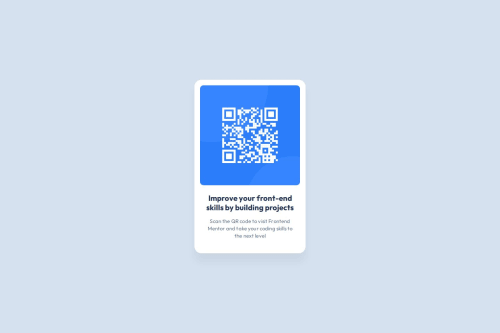
While<section>is semantically meaningful for grouping related content, in this case, the card layout is more of a structural element rather than a semantic section of the document. Using<div>makes your code cleaner and aligns better with its purpose. Semantic tags like<section>should generally be reserved for significant thematic divisions. 😊<div class="section-qr-code"> -
CSS Tweaks for Improved Efficiency:
-
Adjust your
.containerclass slightly:
Removing themin-widthproperty simplifies the code since the max-width constraint already ensures responsiveness. You can also keeppaddingconsistent for better alignment..container { max-width: 375px; padding: 16px; /* Add some breathing space */ margin: auto; } -
Update your
.qr-code-imgclass:
Setting the image width to100%ensures responsiveness, and removing the hardcoded height allows the aspect ratio to stay intact. This improves scalability across devices..qr-code-img { border-radius: 10px; width: 100%; }
-
-
Experiment for Growth:
Rest assured, there’s no major issue here! 🎉 But by making these tweaks, you can further optimize your code and adopt efficient practices. Keep exploring, experimenting, and learning—you’re doing amazing! 🚀
Let me know if you need help with anything else. 👋
Feel free to let me know if you want any refinements! 😊
-

Join our Discord community
Join thousands of Frontend Mentor community members taking the challenges, sharing resources, helping each other, and chatting about all things front-end!
Join our Discord