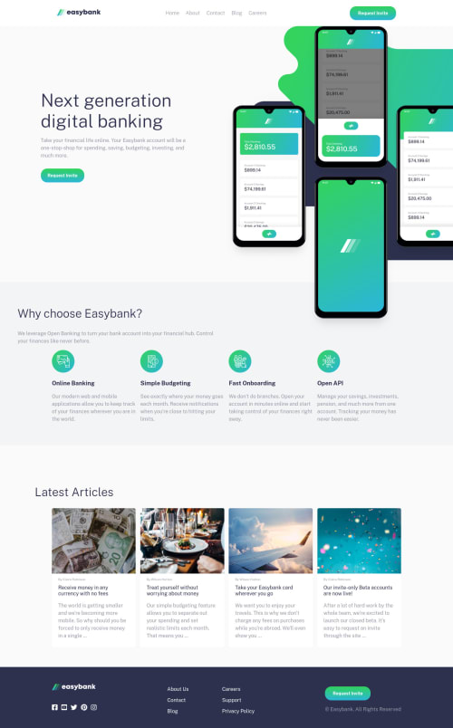
Submitted over 4 years agoA solution to the Digital bank landing page challenge
using flexbox ,js

@EsraaGamal-22
Solution retrospective
rate my design please, Any feedback and suggestions on how I can improve are very welcome!
Code
Please log in to post a comment
Log in with GitHubCommunity feedback
- @ApplePieGiraffe
Oh, hey, esraagamal! 👋
It's nice to see you complete another challenge! 😆
You've done a good job on this one! Your solution looks good and responds nicely! I like the animation on the mobile navigation hamburger menu! 👏
I suggest,
- Adding a little space between the navigation and the hero image in the mobile layout of the site.
- Setting
object-fittocoverfor the images of the article cards so that they do not distort when the screen is resized. - The "Latest Articles" heading moves to the left of the page when the screen width increases. You might want to look into that to make it stays in its place.
Keep coding (and happy coding, too)! 😁

Join our Discord community
Join thousands of Frontend Mentor community members taking the challenges, sharing resources, helping each other, and chatting about all things front-end!
Join our Discord