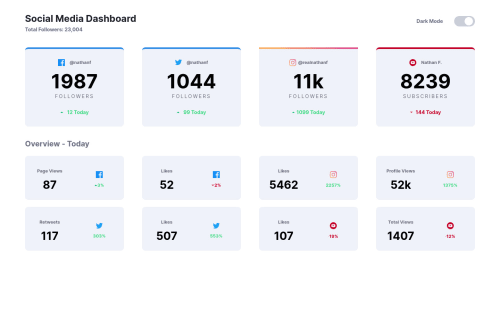
using flexbox, js

Solution retrospective
rate my design please, Any feedback and suggestions on how I can improve are very welcome!
Please log in to post a comment
Log in with GitHubCommunity feedback
- @grace-snow
Hi Esraagamal,
Can I ask why you've opted to use flexbox for this challenge? I think it's meant to be one that helps you learn CSS Grid, and the original design is ideal for a grid layout. You're making it a lot harder for yourself using flex instead.
On mobile at the moment your current solution leaves a load of space on the right (the single column doesn't stretch to full width of the screen. I would look at that.
A great solution for grids like this if you're really keen to stick with flexbox is something like this https://github.com/Heydon/fukol-grids
That's a completely responsive grid that relies on ideal widths. You'd only need to change flex-basis at each breakpoint.
Hope that's helpful. Happy learning! ☺
- @ApplePieGiraffe
Hey, nice job, esraagamal! 🙌
Your solution looks good and the light/dark themes work well! 👍
Just a small suggestion,
- Perhaps instead of breaking into a single-column layout right away when the width of the page becomes smaller, you could break into two columns while there is still available space and break into a one-column layout a little later when there's only room for one. That way, the content would take up more of the available room and there would be less blank space.
Keep coding (and happy coding, too)! 😁


Join our Discord community
Join thousands of Frontend Mentor community members taking the challenges, sharing resources, helping each other, and chatting about all things front-end!
Join our Discord