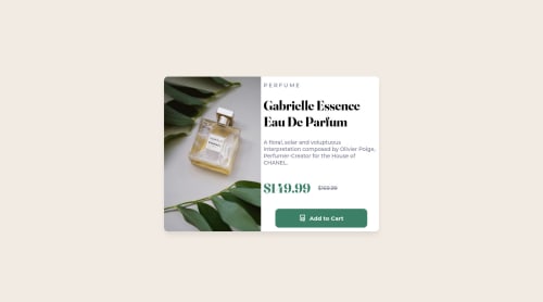
Using Flexbox

Solution retrospective
can someone explain to me how to replace images with css or whatever u know, from desktop images to mobile images
Please log in to post a comment
Log in with GitHubCommunity feedback
- @FalejevV
There is an element in html called <picture>.
Inside tag you can specify multiple screen sizes and images to show. Im bad at explaining, so you better google about it. If you dont want to use multiple div's and css, <picture> is your solution.
Marked as helpful - @Aur71
Put bouth images inside your img-container. To the desktop image give an id = "desktop-img". To the mobile image give an id = "mobile-img"
#desktop-img { display: block; } #mobile-img { display: none; }
Now you just have to use a media querie so you can switch the display when you hit a break point.
@media only screen and (max-width: 600px) {
#desktop-img { display: none; } #mobile-img { display: block; }
And last change the direction of your container
.container { flex-direction: column; } }
Marked as helpful - @Tobshub
Hi, regarding your question: the best way for me is to use a div element instead of an image, and give the div a background-image of the image you want. This way in the media queries, you can specify which image you want (i.e. in the media query for mobile, use the background image for the mobile design on the div, and similarly for the desktop).
Marked as helpful


Join our Discord community
Join thousands of Frontend Mentor community members taking the challenges, sharing resources, helping each other, and chatting about all things front-end!
Join our Discord