Submitted over 4 years agoA solution to the Single price grid component challenge
using flexbox

@EsraaGamal-22
Solution retrospective
rate my design please, Any feedback and suggestions on how I can improve are very welcome!
Code
Please log in to post a comment
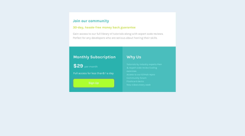
Log in with GitHubCommunity feedback
- @zuolizhu
Hi esraagamal,
Nice try on this project 👏! The responsive from mobile to desktop looks good!
However, I feel the color of the signup button is too bright. It is hard to see the text "sign up" on my screen.
#C0DF33would be a better color for that button 🤓.I would also add a
max-width: 1110px;to thecontainer, so that it would not stretched out on larger size screen.Happy coding 🙌!

Join our Discord community
Join thousands of Frontend Mentor community members taking the challenges, sharing resources, helping each other, and chatting about all things front-end!
Join our Discord