Submitted about 3 years agoA solution to the 3-column preview card component challenge
Using flex-wrap and media querys for responsiveness
accessibility

@r-mayer
Solution retrospective
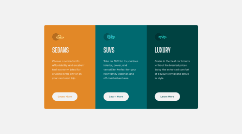
In my solution, I used an intermediate stage of responsiveness between the desktop version and the mobile version, where two cards are next to each other in the same line and the third one goes down. For this, I used the flex-wrap property and some media querys.
As there was no indication about the behavior on medium-sized screens, I had to adapt to what I thought was best.
In your opinion, what would be the best practice in these cases?
Code
Loading...
Please log in to post a comment
Log in with GitHubCommunity feedback
No feedback yet. Be the first to give feedback on Rodrigo Mayer's solution.
Join our Discord community
Join thousands of Frontend Mentor community members taking the challenges, sharing resources, helping each other, and chatting about all things front-end!
Join our Discord