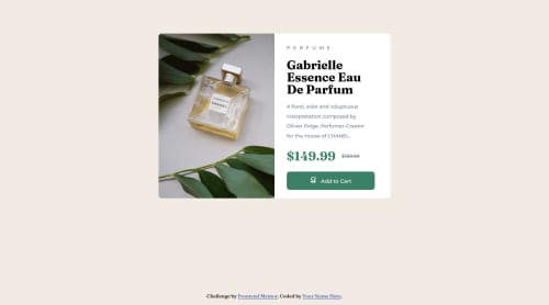
Using Vanilla HTML/CSS for Product Review Card

Solution retrospective
This was great to make! I was able to apply some learning I did about rem and flexbox to create a more responsive layout compared to using pixels to make the design.
The main thing I had trouble though was making the images switch back and forth from the desktop version of the image to the mobile version. Any suggestions on how to do this? I wanted to make sure I was only using HTML/CSS but found there isn't a way to directly manipulate the image source using just those two.
Please log in to post a comment
Log in with GitHubCommunity feedback
- @GiuliaT97
You can try to use picture tag with source and img in your html document instead of using only img tag. Below is an example of the code.
<picture class="img_content"> <source srcset="assets/images/image-product-desktop.jpg" media="(min-width: 600px)"> <img src="assets/images/image-product-mobile.jpg" alt="perfume"> </picture>Marked as helpful - @0xabdulkhaliq
Hello there 👋. Congratulations on successfully completing the challenge! 🎉
- I have other recommendations regarding your code that I believe will be of great interest to you.
CSS 🎨:
- Looks like the component has not been centered properly using
flex.
- You already used
Flexboxfor layout. You can read more about centering in CSS here 📚. Now just add the following style rule in your css file
body {
    min-height: 100vh;
}
- Now your component has been properly centered
.
I hope you find this helpful 😄 Above all, the solution you submitted is great !
Happy coding!
Marked as helpful - @archisvaze
Nice!! Looks perfect!! TBH I would not put the style.css in assets but thats just me. I would include it in the src or the main folder(same as index)


Join our Discord community
Join thousands of Frontend Mentor community members taking the challenges, sharing resources, helping each other, and chatting about all things front-end!
Join our Discord