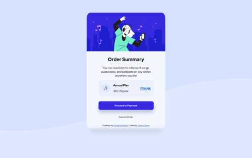
Submitted over 3 years agoA solution to the Order summary component challenge
Vanilla CSS with FlexBox Row for certain components.

@QZheng16
Solution retrospective
This is my first time posting so I hope I submitted everything correctly. If I can get some feedback on if I am doing stuff correctly or not, like if I am following certain convention etc.
Code
Please log in to post a comment
Log in with GitHubCommunity feedback
- @pikapikamart
Hey, awesome work on this one. Layout in general looks great but on mobile state, the layout is not adapting to the screen-size.
Some suggestions would be:
- Always have a
mainelement to wrap the main content of your page. On this one, the.cardshould be using themaininstead ofdiv. - Also on this one, I would use
footerfor the.attributionand use this markup:
<main /> <footer />- The music-icon is just a decoration so better hide it. Decorative image must be hidden at all times for screen-reader users by using
alt=""and extraaria-hidden="true"attribute on theimgtag. - Also when using
altattribute, avoid using words that relates to "graphic" such as "icon" and others. Animgis already an image/graphic so no need to describe it as one. - Good choice using heading tag on the annual-plan but incorrect choice of level. When using heading tag, make sure you aren't skipping a level. If you use
h4make sure thath1, h2, h3are present "before" it. - Also, I just notice you are using
inline-blockfor the.cardyou don't really make use of this one on an element that is holding like a large content, having the defaultblockis better, using theinline-blockas well prevents the element being centered bymargin: 0 auto.
Aside from those, great job again on this one.
- Always have a

Join our Discord community
Join thousands of Frontend Mentor community members taking the challenges, sharing resources, helping each other, and chatting about all things front-end!
Join our Discord